Introduction
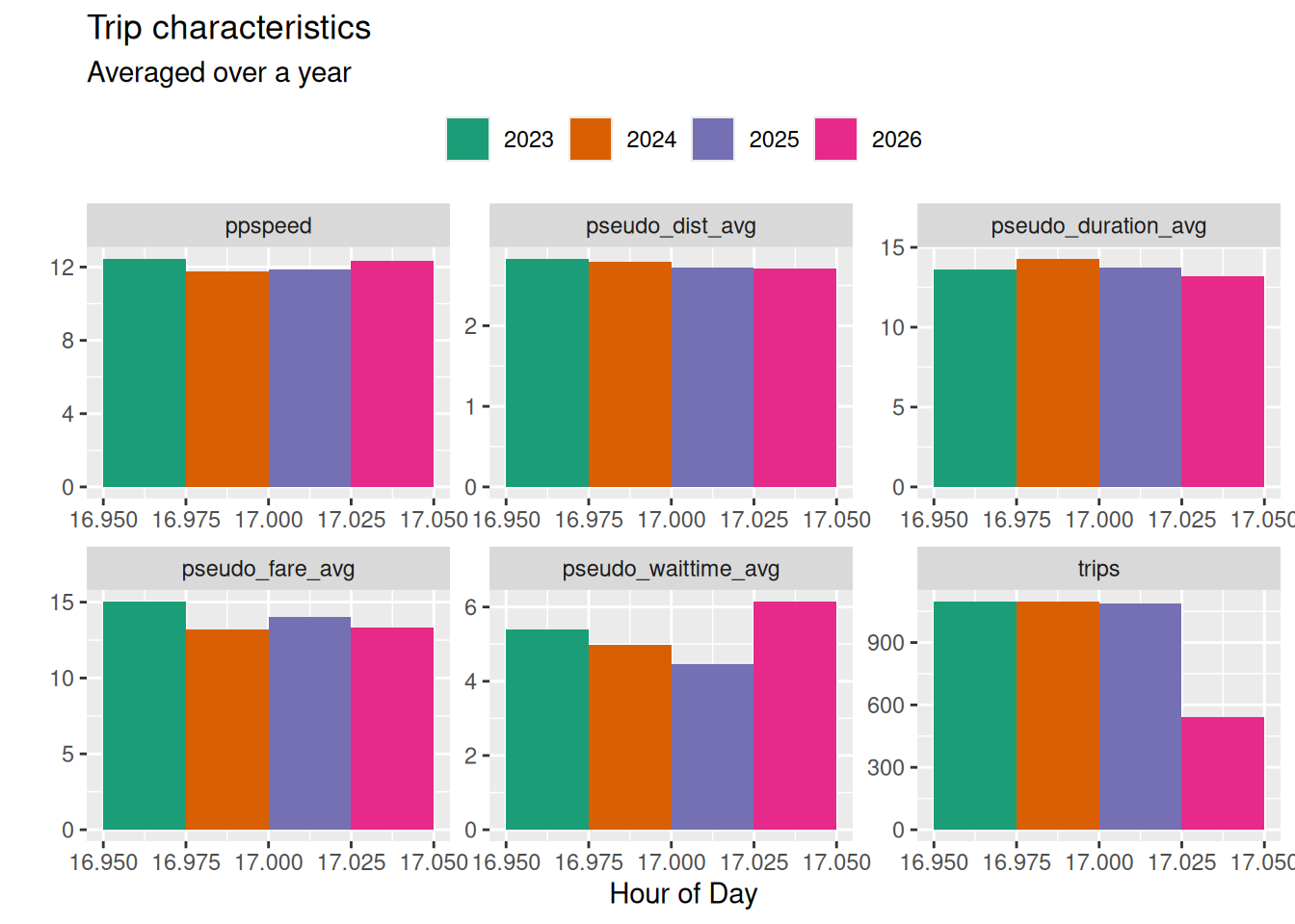
This set of charts uses the City of Toronto’s open data on Private Transportation Companies (PTCs) to follow monthly trends in the Greater Toronto Area ridehail market.
Geography
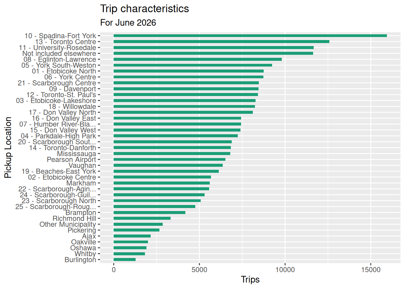
Here’s a first look at trips by location. No conclusions yet.
Wait time by ward
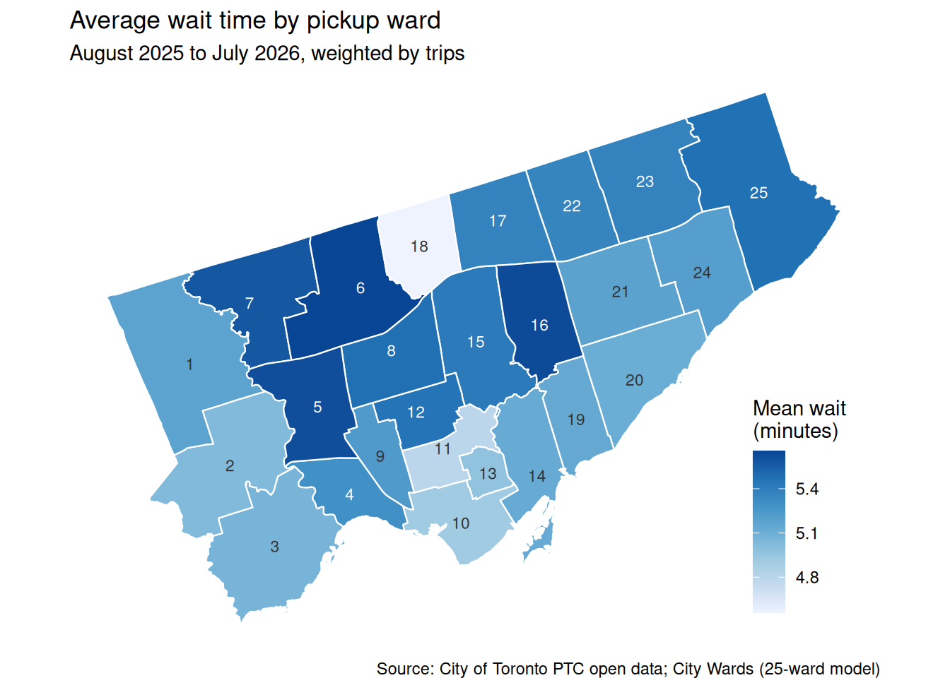
Average wait time for pickups in each City of Toronto ward over the latest twelve months, weighted by trips. Pickups outside the City (and the open data’s “Not included elsewhere” ward) are excluded. Ward boundaries are the City’s 25-ward model, downloaded by bin/download_ward_profiles.py.
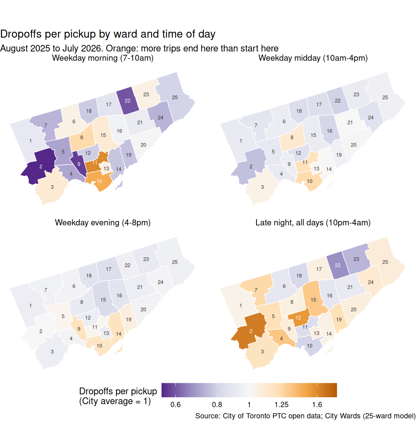
Dropoffs per pickup by ward
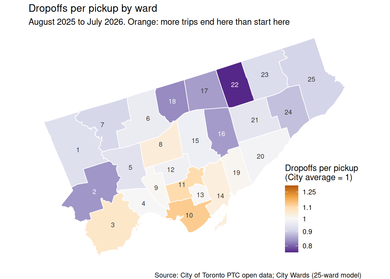
The open data doesn’t say where drivers are while they wait for a request, so utilization can’t be measured ward by ward. This map shows one of its local causes instead: whether more trips end in a ward than start there. Where they do, drivers are left in a ward with fewer new requests than arrivals, and either wait there or drive empty to find the next one.
Each ward’s dropoffs are divided by its pickups over the latest twelve months, and indexed so the City average is 1. The index corrects for trips that end outside the City (for example, at the airport), which make the raw ratio less than 1 in every ward. Trips starting outside the City count as dropoffs in the ward where they end.
Two things to bear in mind. Wards on the City boundary (for example 2, 18 and 22) score low partly because many of their trips end in neighbouring municipalities, so those drivers finish their trip outside the City. And the figures are over whole days: flows that reverse between morning and evening cancel out here.
By time of day
The whole-day figures hide flows that reverse during the day, so this repeats the index for four periods. Each period is indexed to its own City average. Pickups are assigned to a period by the hour they start; the three weekday periods run Monday to Friday, and the late-night period covers every day of the week.
Ward 13 - Toronto Centre
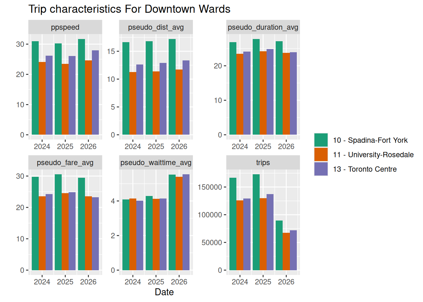
Ward 13, Time of Day