Introduction
This set of charts uses the Chicago Trips data set to check monthly trends. To make the analysis more tractable, it uses a 1-in-16 random sample of trips – every trip whose ID begins with a given hex digit – drawn from every day of the month. Trip IDs are hash digests, so the sample is unbiased, and covering every day means it carries the real day-of-week pattern. Averages and shares are read straight off the sample; trip counts are scaled back up by the measured sampling ratio.
It hopes to capture both sudden changes and continuing trends in the overall ridehail landscape in Chicago. The data set does not include earnings data or driver time spent en route to pick up passengers or waiting for a trip request.
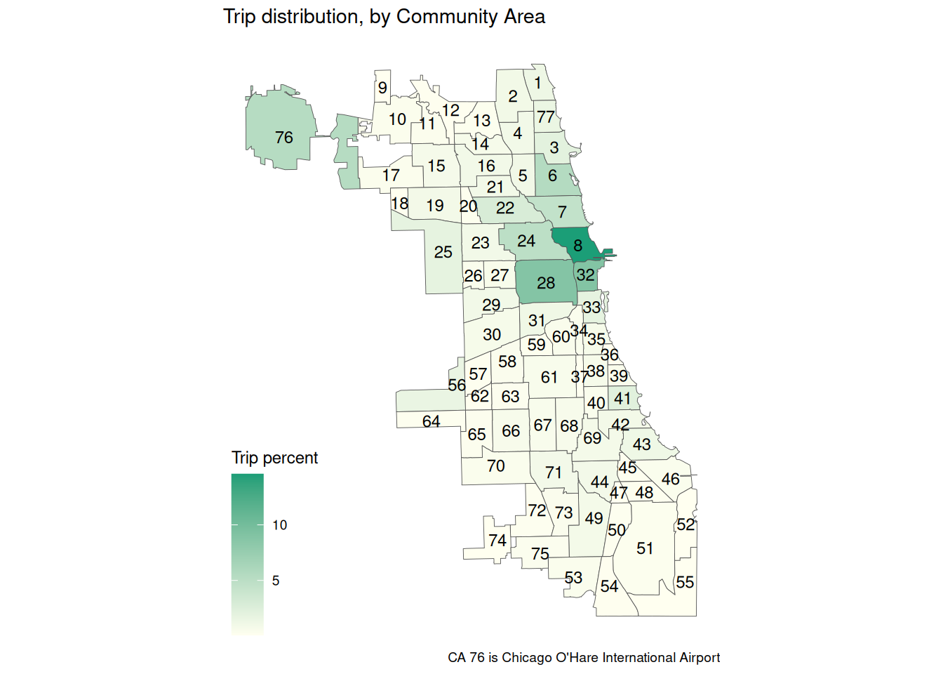
Community Area map
Thanks to Daryn Ramsden’s geojson representation of Community Areas, we can display the community areas as a map. It shows how trips are concentrated in the downtown area and at Chicago O’Hare International Airport.
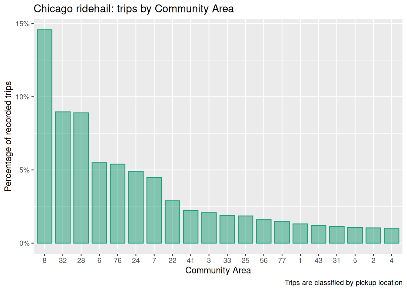
Trips by Community Area
Chicago has 77 community areas, listed here. Chicago trip data is broken down by community area.
Downtown and elsewhere
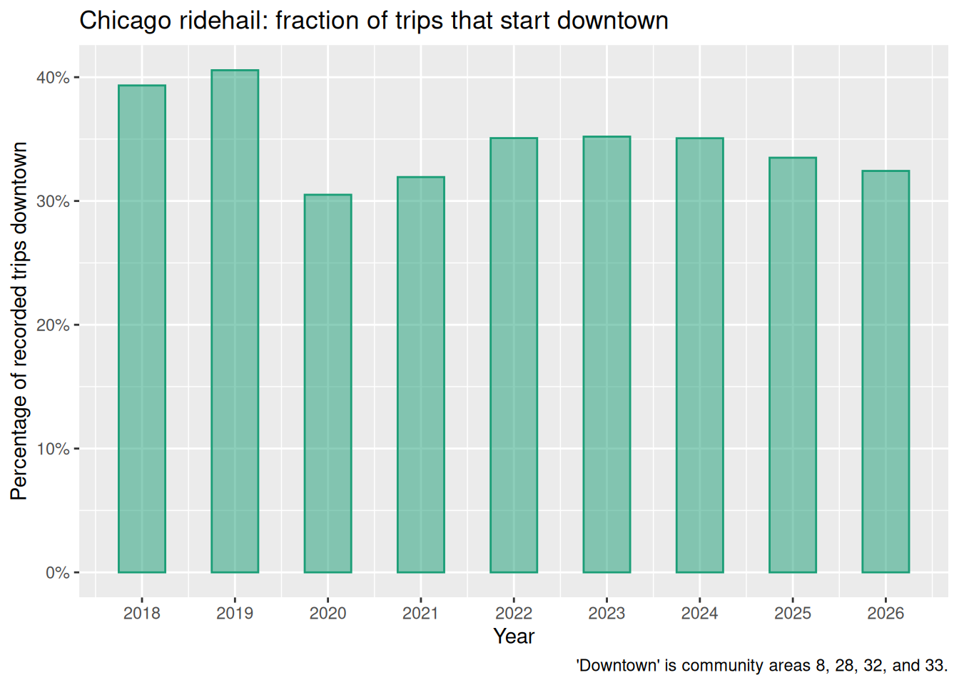
We can identify a small set of community areas as “downtown”: these are community areas 8 (Near North Side), 28 (Near West Side), 32 (Loop), and 33 (Near South Side).
Downtown is responsible for about a third of all trips. The chart runs monthly rather than annually: the sample is collected a month at a time, working backwards, so a calendar-year bar would compare a part-year against a full one. It extends itself to the left as the backfill continues.