Introduction
This set of charts uses the Chicago Trips data set to check monthly trends. To make the analysis more tractable, it uses a 1-in-16 random sample of trips – every trip whose ID begins with a given hex digit – drawn from every day of the month. Trip IDs are hash digests, so the sample is unbiased, and covering every day means it carries the real day-of-week pattern. Averages and shares are read straight off the sample; trip counts are scaled back up by the measured sampling ratio. For information about the data sets, see Dashboards home page.
It hopes to capture both sudden changes and continuing trends in the overall ridehail landscape in Chicago. The data set does not include earnings data or driver time spent en route to pick up passengers or waiting for a trip request.
Algorithmic fares
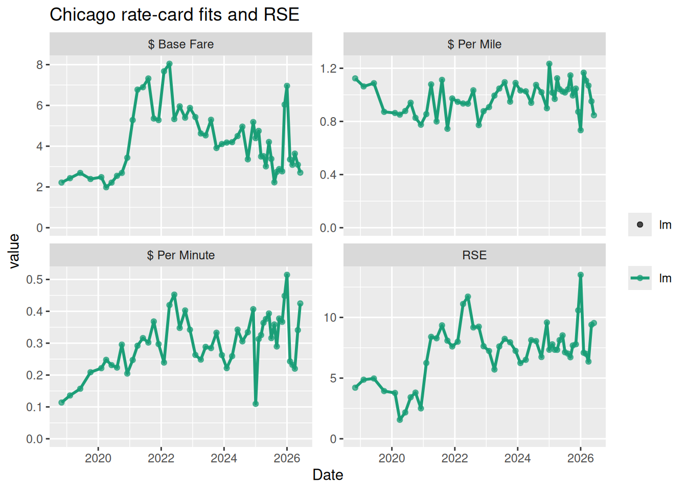
Fares and earnings were originally set using a “rate card” model of a base fare plus per-minute and per-mile rates, sometimes with a surge pricing multiplier. With the introduction of “upfront pricing”, Uber can set prices individually for trips, based on many factors.
One way to look at algorithmic fares is to fit the fares for a given month to a “rate card” model and then to look at the deviation from that model, which is the “Residual Standard Error” (RSE) of the fit. A larger RSE means that the individualized (per-trip) algorithmic components have a bigger impact on the passenger fare.
The equivalent Toronto chart fits the same model, but in dollars per kilometre and on hourly cell averages rather than individual trips, so neither the coefficients nor the RSE can be compared directly across the two cities.
Community Area-based deviations
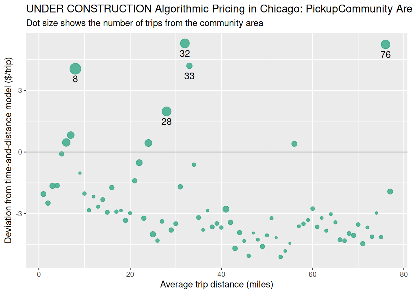
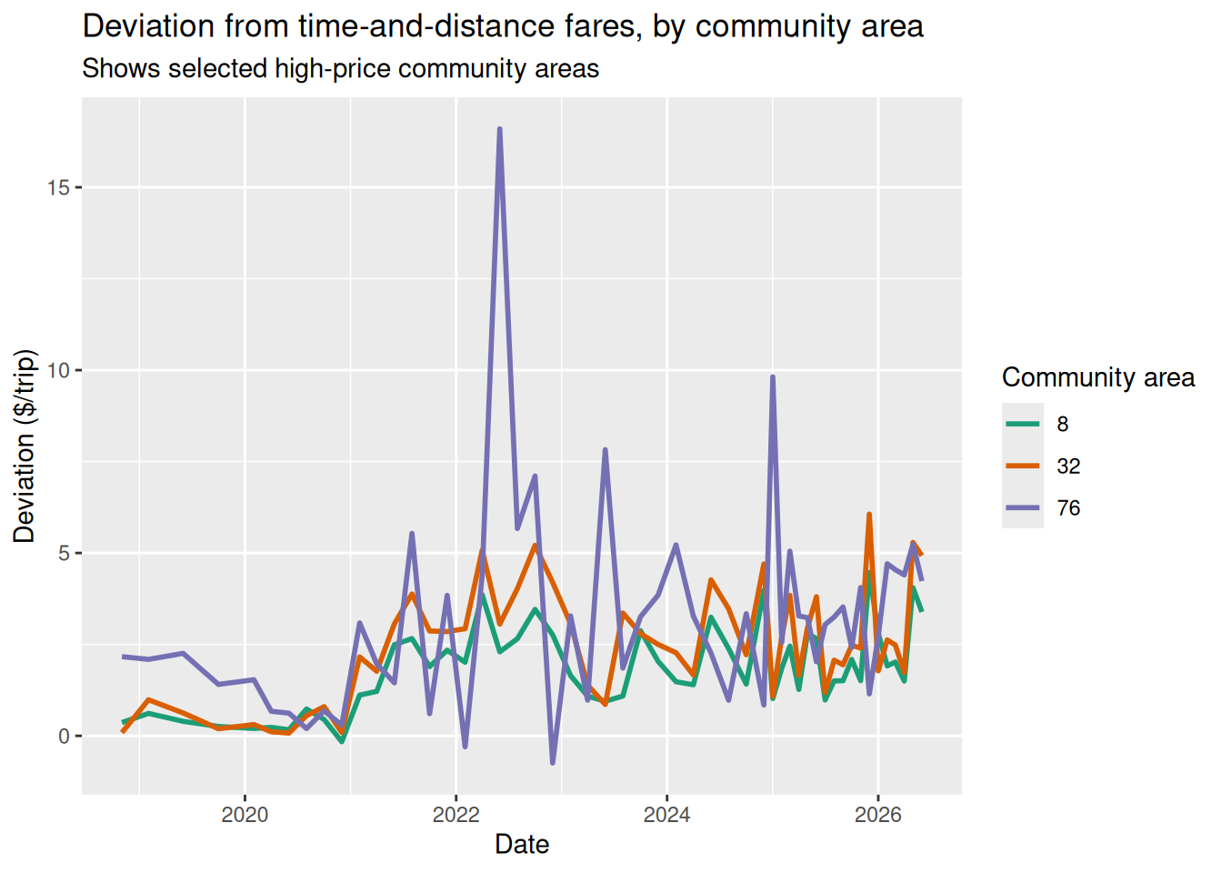
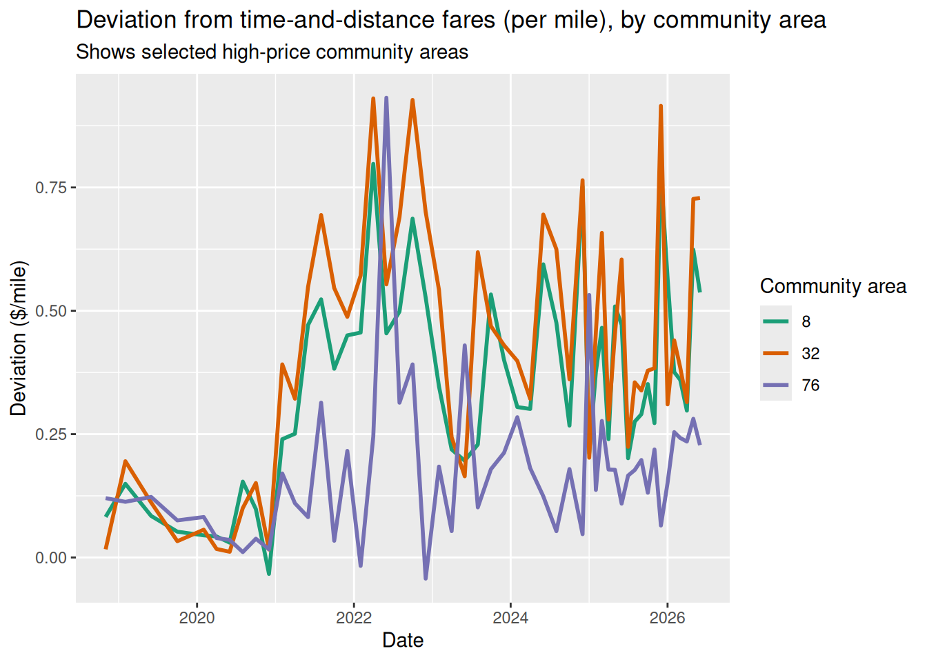
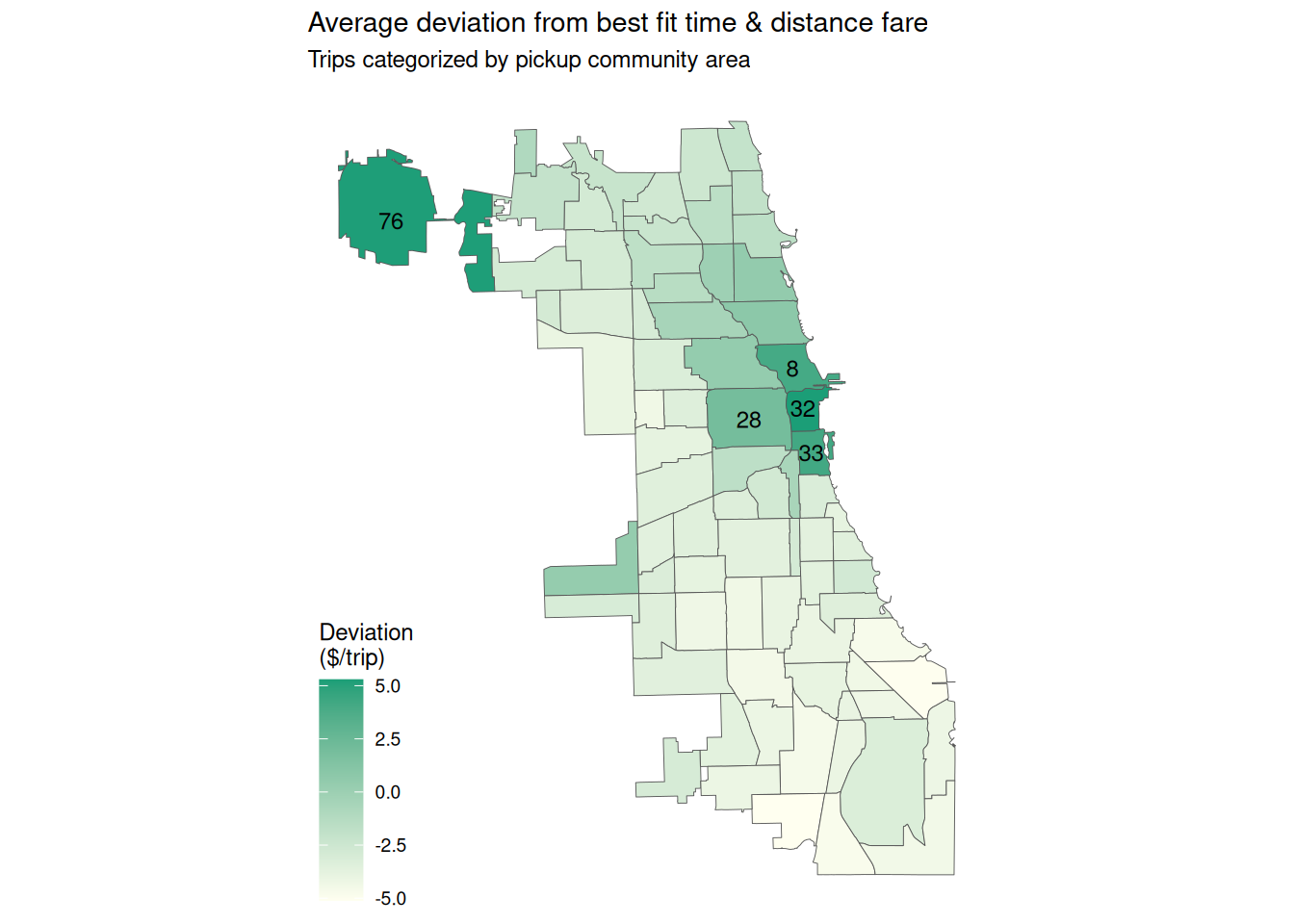
Although we cannot unpick all the factors that shape Uber’s pricing algorithm, Figure 1 shows how the fare for trips starting in each community area deviates from the best “rate card” fit for the month. The equivalent Toronto chart does the same by ward.
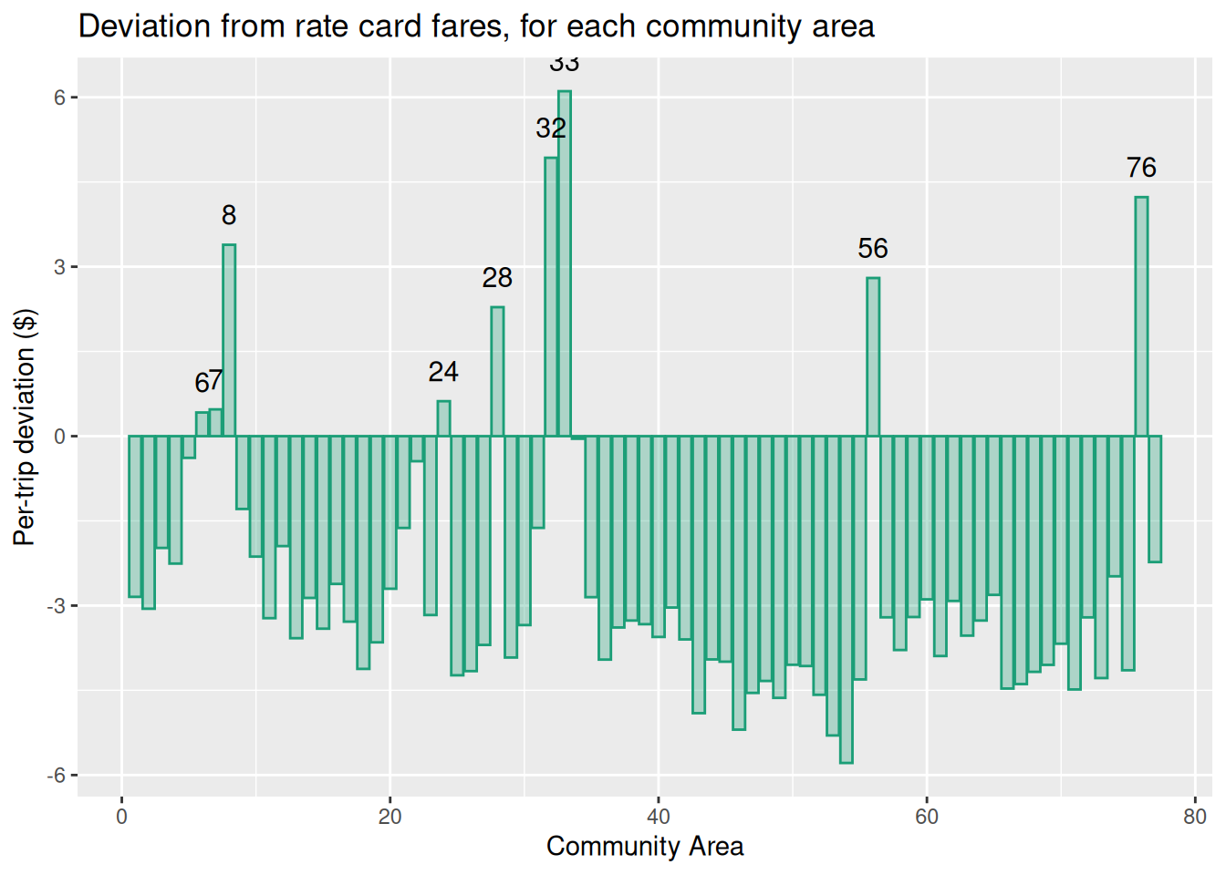
Community Area deviation from model (per trip)
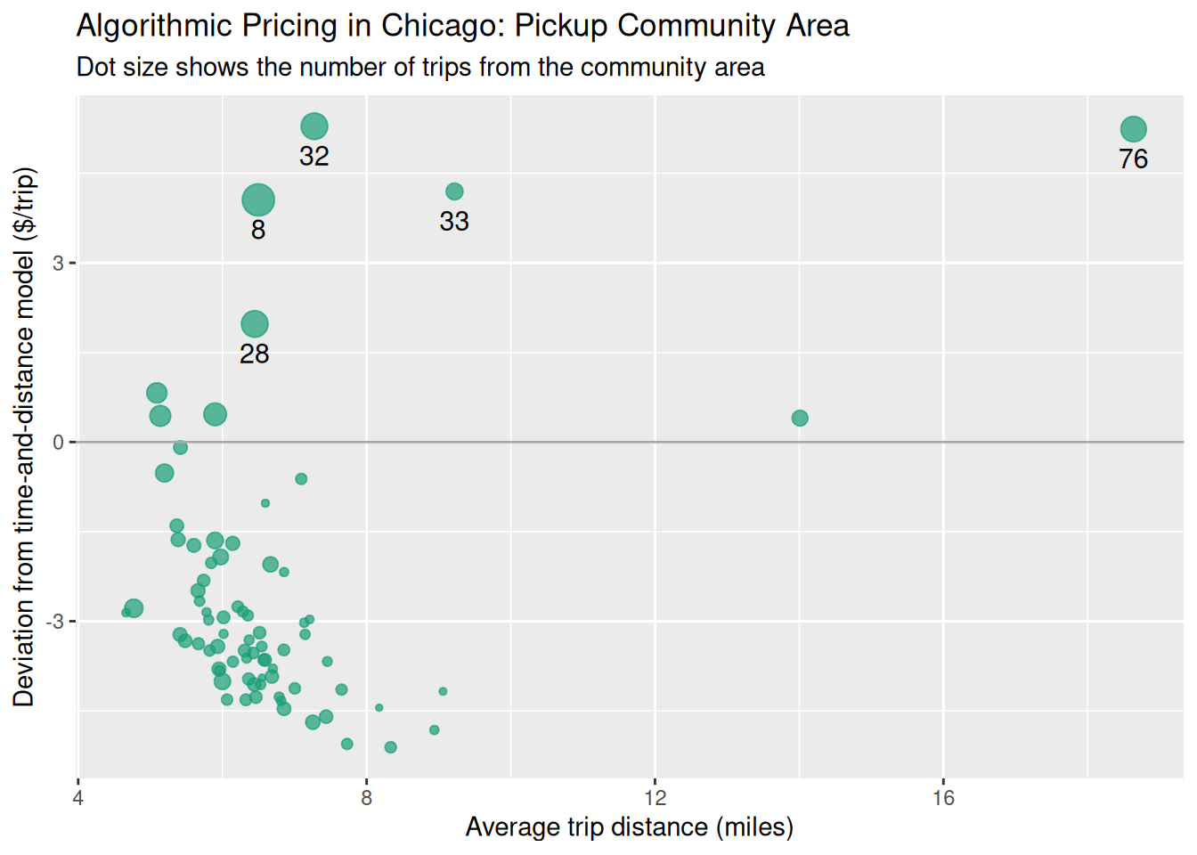
Community Area deviation from model (per mile)
O’Hare and others over time
Deviation per mile from model
Community area map
Hour-of-day dependence (rush hour surge)
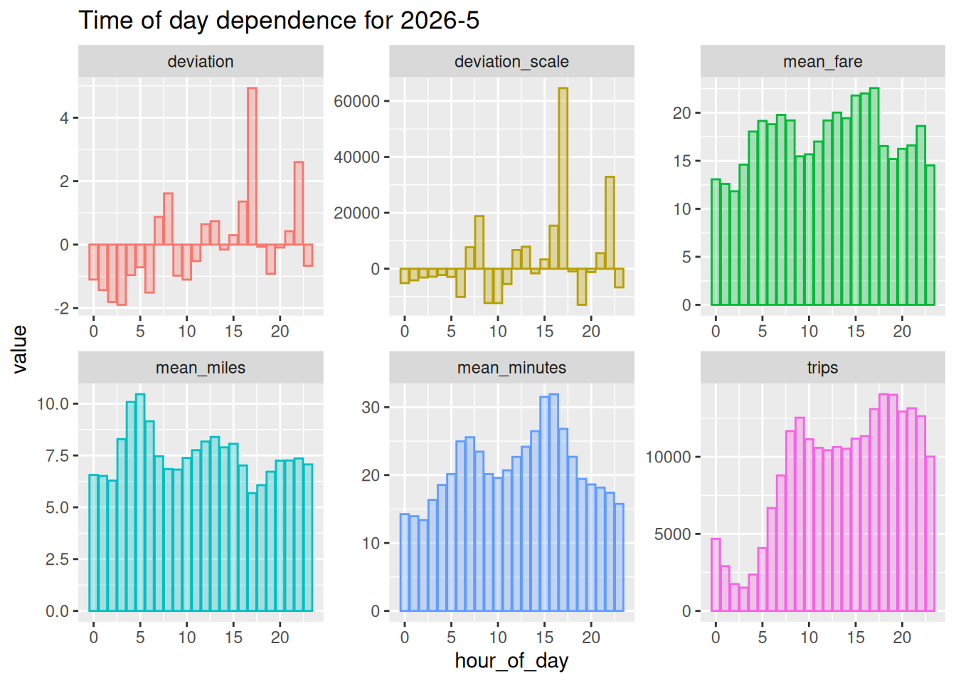
The “deviation” plot shows that rush hours are charged extra over the model average. The “deviation_scale” plot multiplies deviation by the number of trips, which is also high, so rush hours bring in a lot of income.