Introduction
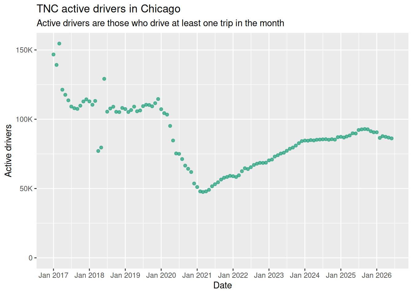
This set of charts uses the Chicago Drivers data set to check monthly trends. It hopes to capture both sudden changes and continuing trends in the overall ridehail landscape in Chicago: this page focuses on driver statistics. The data set does not include earnings data or driver time spent en route to pick up passengers or waiting for a trip request.
Longevity and churn
Although the driver population may look the same now as it did years ago, that doesn’t mean it’s the same drivers. This section looks at how long drivers stay on the platform, and how the churn affects passenger experience.
New starts and quits, by month
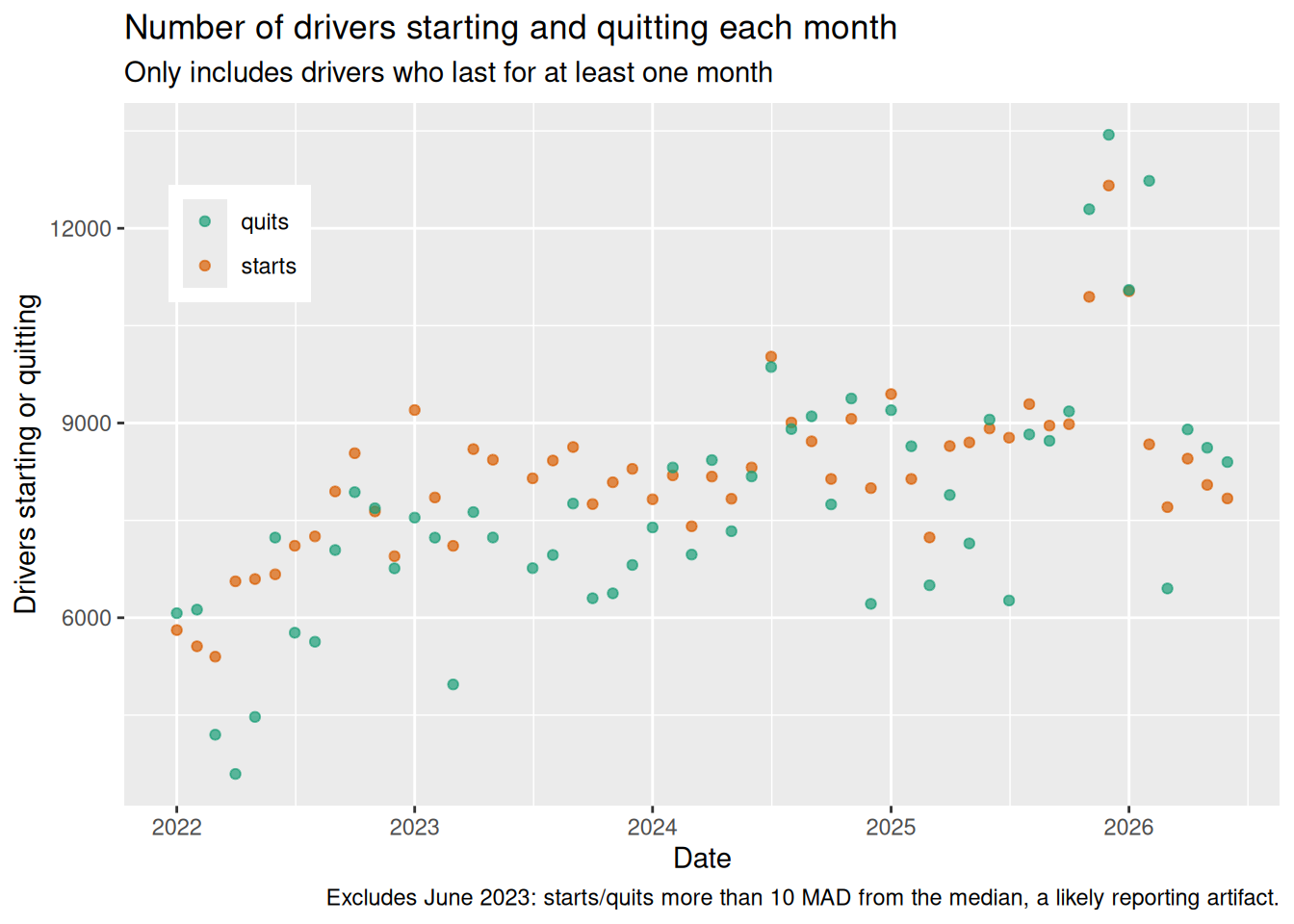
The change in driver numbers is the difference between the number that start work on a TNC platform in a given month and those that quit. Figure 2 shows both of those numbers over recent years. This continual flux of drivers in and out of the market shape other charts, below.
Drivers quitting the platform
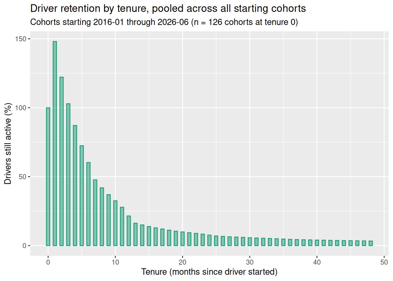
Figure 3 shows how long drivers last on the platform. It shows what percentage of drivers are still working after a number of months, adding up numbers for all starting months since 2016.
The increase in number of drivers in the first month is reflects onboarding time: the chart displays all activer drivers and compares the number to the “driver_start_month” in the data set. Each driver has a “driver_start_month”, but some do not start driving on the platform until the following month and hence only appear in the data set with a lag of one.
Current driver population by longevity
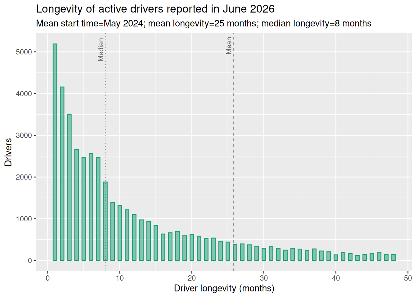
Figure 4 shows the driver population for the most recent month in the data set, and shows the distribution of drivers, by longevity, on the platform in that month.
- The biggest single group of drivers are those new to the platform.
- The typical driver has been on the platform for less than a year.
- The average driver longevity is just over two years.
The evolution of longevity
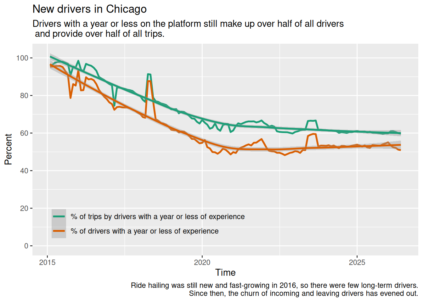
It can be easier to interpret this if we lump drivers into new or long-term workers, based on whether they have been on the platform for more or less than a year.
Driver mean and median longevity over time
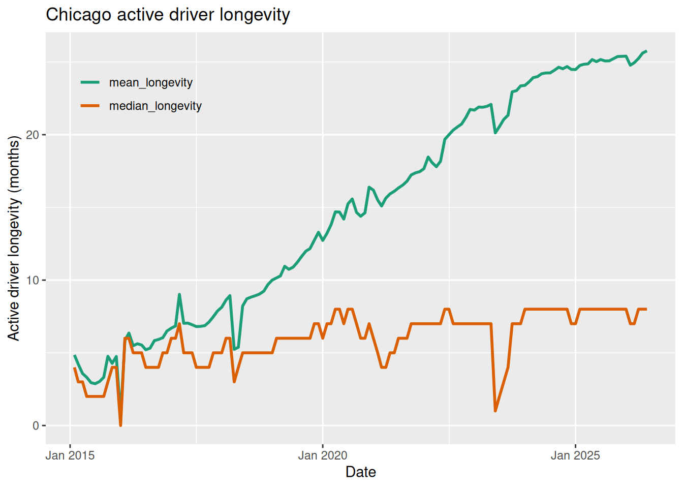
Both mean and median longevity (below) confirm the observation that the driver population has been on the platform for longer, over time, albeit with a major Covid interruption.
The Chicago data does not allow us to see whether drivers have gaps in their work: we just have a first month they are recognized and the reporting month.
The typical driver has now been on the platform for almost a year. Drivers who drive more trips have, on average, been on the platform just a little longer.
Trip distribution by driver longevity
In a given month, how many trips are given by drivers with a residency of X months?
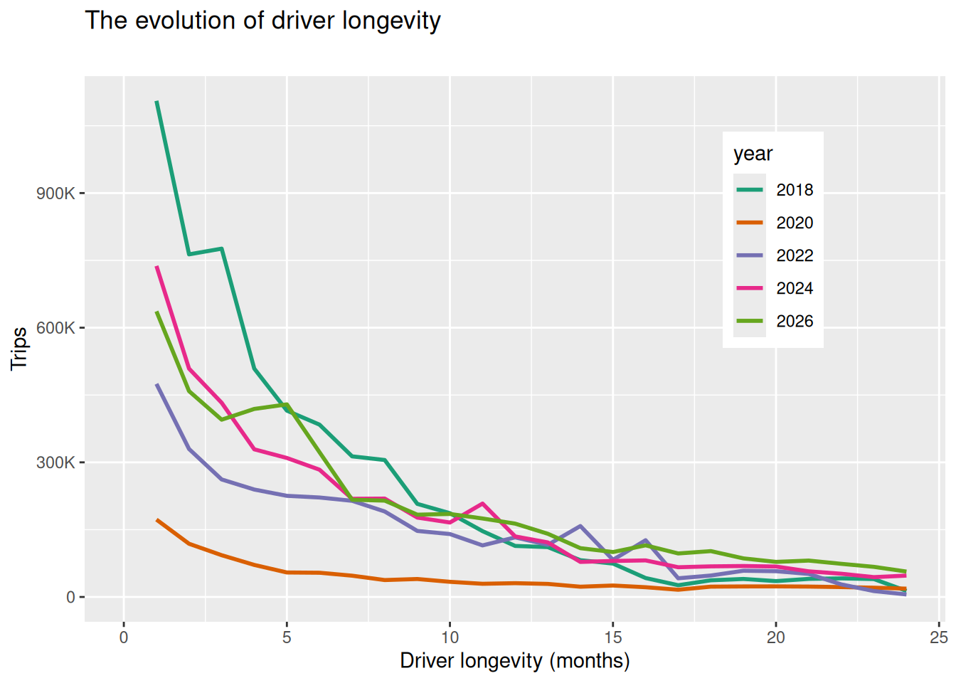
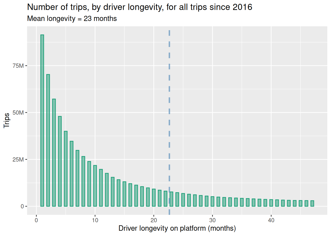
Figure 6 shows the number of trips drivers of a given longevity provide, over all months.