Summary of findings
Toronto and Chicago’s ridehail systems are remarkably parallel in structure — but they diverge sharply on exactly the things the platforms control. Where the two markets look alike (trip volume, downtown concentration, driver-body composition, congestion geometry, the presence of location-based pricing), it is because the underlying urban physics and platform playbook are the same. Where they differ (fare trajectory, fleet size, driver utilization and pay), it is because Uber and Lyft made different choices in each city. Reading the two datasets together lets each city’s data fill the other’s blind spots — Chicago publishes per-trip fares (so we can see pricing); Toronto publishes driver time-use (so we can see idle time and pay).
The two cities at a glance (2025)
| Chicago | Toronto | |
|---|---|---|
| Ridehail trips/day | ~250k | ~239k |
| Avg fare | $18 USD (flat since 2021) | $20 CAD (falling since 2022) |
| Downtown share of pickups | 34% | 35% |
| Downtown speed | ~26 km/h | ~24 km/h |
| Active drivers / vehicles | 61k drivers | 75k vehicles |
| Driver utilization (on-trip %) | ~55–65% (imputed) | ~50% (measured, falling) |
| 12-month retention | ~16% (drivers) | ~48% (vehicles) |
| Empty (deadhead) miles | ~1 Mkm/day (imputed) | ~1 Mkm/day, rising |
| Data superpower | per-trip fares → pricing | driver time-use → labor & idle |
Major observations
- Volumes converged; fares diverged. By 2025 both cities run ~240–250k trips/day, but Chicago fares stepped up +48% in 2021 and held, while Toronto fares peaked in 2022 and have fallen since (Section 4).
- Both cities decoupled fares from time-and-distance — Toronto silently. The algorithmic-pricing signature (rising fare dispersion unexplained by trip length) appears in Chicago from 2021 and in Toronto from ~2022 — but Toronto got the personalization without an average-fare increase (Section 5).
- A real downtown price premium exists in both cities — net of trip length, downtown fares run ≈ +$2.1 (Chicago) / +$1.3 (Toronto) above the time-distance line, while the rest of the city sits below it (Section 7).
- Toronto is oversupplied and slowing; Chicago is tighter and flat. Toronto fields more vehicles (75k) than Chicago has drivers (61k) for the same volume; its on-trip speed fell 37→32 km/h and its deadhead share rose 27%→35% (Section 6, Section 11). Both put ~1 Mkm/day of empty driving on the road.
- Utilization fell in Toronto — and the mechanism indicts a hidden metric. Utilization dropped 60%→50% even though trips per vehicle stayed flat, because hours rose and idle time ballooned. Flat trips-per-driver therefore tells us nothing about utilization; Chicago’s is only bounded (≈55–65%) and its trend is unknowable without the driver-hours field it omits (Section 10).
- Toronto vehicles are far “stickier” than Chicago drivers — ~48% vs ~16% still active at 12 months (partly a vehicle-vs-driver artifact) (Section 12).
- Driver take-home is eroding. Toronto gross rider-fares per working hour fell $47 (2022) → $33 (2025); after commission, costs, and unpaid idle time, net pay is plausibly near or below minimum wage — invisible in Chicago’s data.
Cross-cutting insight
The platforms extract margin two ways — raising the level (Chicago’s 2021 jump) and raising the dispersion (personalized, location/time-tuned pricing, in both cities). Chicago used both; Toronto used dispersion while holding the level down. The highest-leverage transparency ask that falls out of this work: every PTC dataset should publish driver logged-in / idle time, as Toronto does — it is the field that makes the “invisible pay cut” visible.
Full working notes and every query: to_chi_observations.md. Extended synthesis and the backlog of further topics: to_chi_summary.md.
Reconciling the two datasets
Toronto and Chicago publish very different data. The table below (and the fuller account in to_chi_observations.md, Part A) records the reconciliation facts that make the comparisons in this document valid.
The single most important one: Chicago’s per-trip file is a sample of one weekday per month — the first Thursday — not a full census of trips. That makes Chicago per-trip averages representative of a typical weekday, and Chicago’s sample-day volume directly comparable to Toronto’s average daily volume. It also means true Chicago monthly totals must come from the driver panel, not from counting sampled trips.
  year month distinct_days sample_trips sample_day
1 2019     2             1       313272 2019-02-07
2 2019     6             1       307510 2019-06-06
3 2019    10             1       288371 2019-10-03
4 2024     2             1       240144 2024-02-01
5 2024     4             1       255754 2024-04-04
6 2024     6             1       245803 2024-06-06
7 2024     8             1       275837 2024-08-01
8 2024    10             1       238310 2024-10-03
9 2024    12             1       278925 2024-12-05
Trip volume
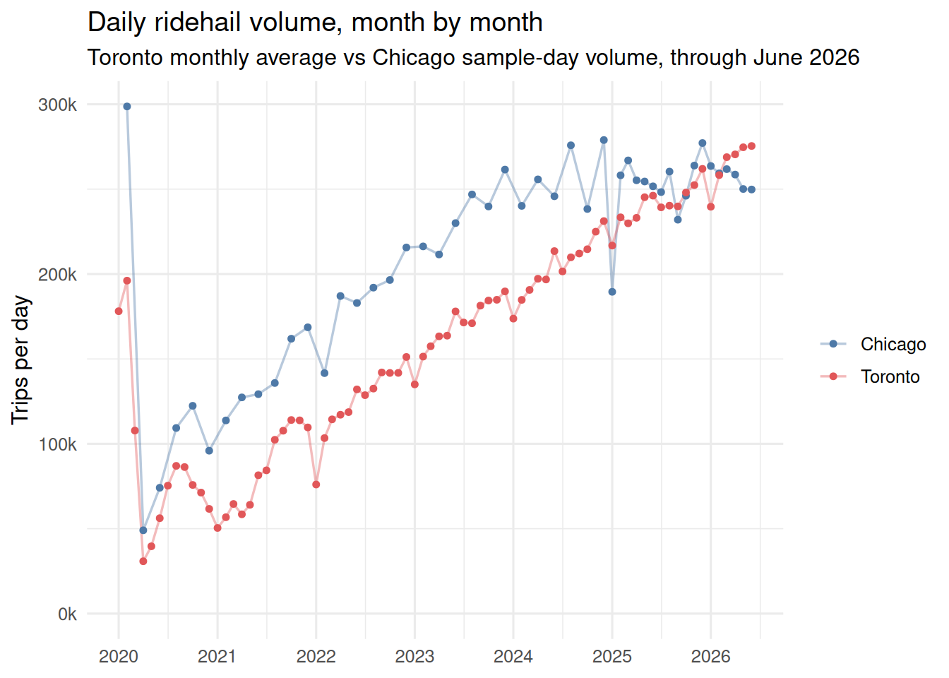
Chicago sample-day volume vs Toronto average daily volume, month by month through June 2026. The two cities track each other closely from 2025 on, both running ~250–275k trips/day. Read the cadence carefully: Toronto is a true monthly average (full population), while each Chicago point is its single monthly sample day — sampled every second month before 2025, then monthly.
Fares
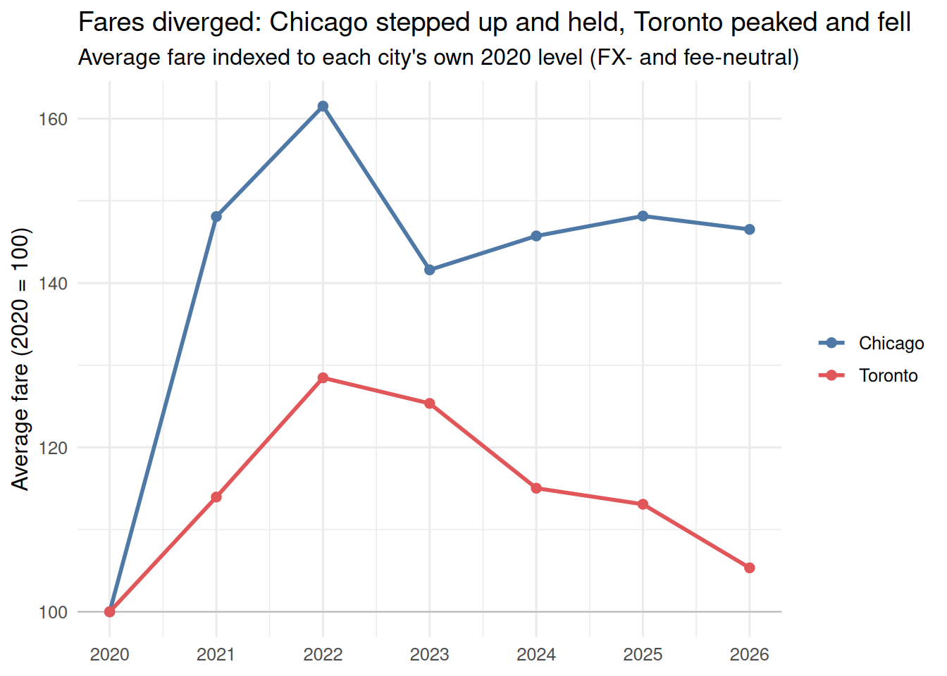
The central divergence. Chicago fares stepped up ~48% in 2021 (the onset of “upfront pricing”; see chicago_algorithmic_pricing.qmd) and held flat. Toronto fares peaked in 2022 and have declined since. Because the two are in different currencies (USD / CAD) with different inclusiveness (see to_chi_observations.md Part A), Figure 2 indexes each city’s average fare to its own 2020 level (= 100). Indexing cancels the level, the currency, and the fee-inclusiveness differences, leaving only the trajectory — which is the point.
fare (excludes booking fees); Toronto uses total fares / trips. 2026 covers January–June.
Indexed this way the split is stark: Chicago’s fares jumped ~48% in 2021 and have sat ~45% above their 2020 level ever since, while Toronto’s rose more gently to a 2022 peak (~+28%) and have since fallen almost all the way back — only ~5% above 2020 by 2026. Same starting point, opposite paths.
Algorithmic pricing: the decoupling signature
Chicago’s chicago_algorithmic_pricing.qmd detects “upfront pricing” as a decoupling of fares from a time-and-distance model: fit fare ~ per_mile·miles + per_min·minutes monthly on per-trip data and watch the residual standard error (RSE). Chicago’s RSE roughly doubled in 2021 as fares jumped — prices stopped following the formula.
Toronto publishes no per-trip fares, only cell averages. But we can port the idea: fit fare_avg ~ distance_avg + duration_avg across origin-destination × hour cells each month (trip-weighted), and track the weighted residual RMSE and R². This measures between-cell pricing — how much location and time-of-day move the fare beyond what trip length explains — the location-tuned pricing Chicago’s report flags. It is a lower bound on true per-trip dispersion (within-cell variation is already averaged away). Toronto fares begin 2020.
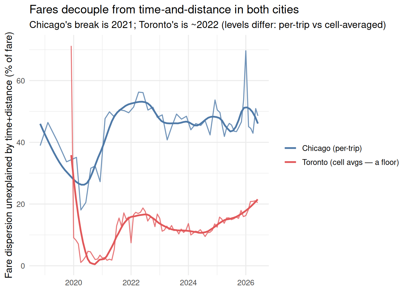
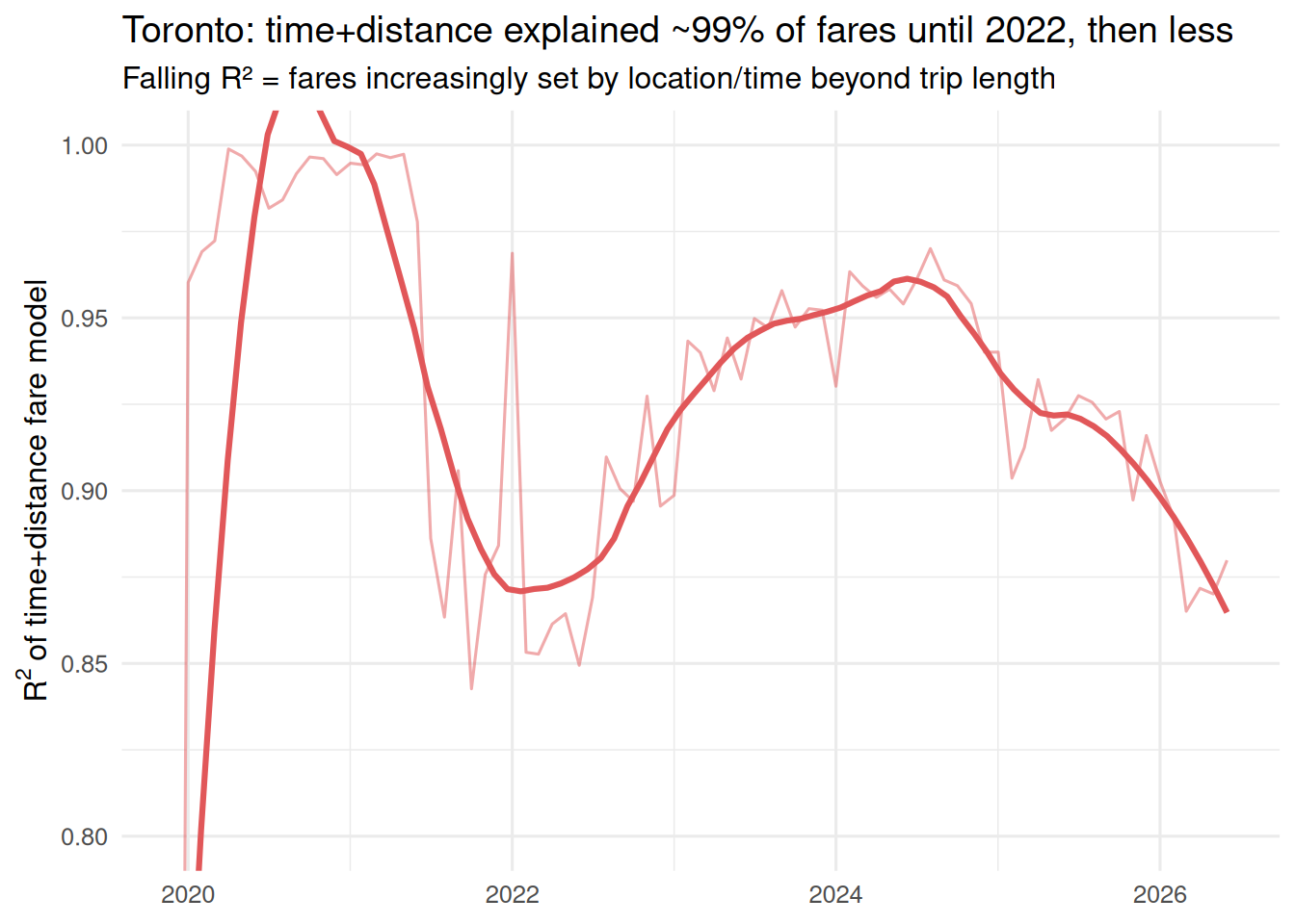
The absolute levels differ by construction — Chicago’s is per-trip, Toronto’s is a cell-averaged floor — so read the timing and direction, not the gap. Toronto’s R² makes the break explicit:
The fitted fare models
The underlying time-and-distance fits — the “best-fit fare = base + per-km × distance + per-minute × time” that the RSE is measured against — are below. Chicago’s are the stored per-trip lm fits (citywide); Toronto’s are the annual means of the monthly weighted cell fits above. Chicago’s per-mile coefficient is converted to per-km (÷ 1.609). Levels are native currency (USD vs CAD).
| Year | CHI base $ | CHI $/km | CHI $/min | TOR base $ | TOR $/km | TOR $/min |
|---|---|---|---|---|---|---|
| 2020 | 2.56 | 0.53 | 0.24 | 6.47 | 0.90 | 0.23 |
| 2021 | 6.15 | 0.58 | 0.30 | 6.94 | 0.95 | 0.25 |
| 2022 | 6.38 | 0.57 | 0.37 | 7.77 | 1.15 | 0.23 |
| 2023 | 4.65 | 0.63 | 0.28 | 6.95 | 1.10 | 0.24 |
| 2024 | 4.39 | 0.62 | 0.31 | 5.00 | 1.03 | 0.29 |
| 2025 | 3.61 | 0.65 | 0.34 | 4.03 | 0.86 | 0.44 |
Reading the coefficients: Chicago’s 2021 fare jump landed mostly in the base fare ($2.6 → $6.2) with per-km and per-minute rates roughly steady — an across-the-board markup rather than a change in the distance/time schedule. Toronto’s later fare decline came from a falling base ($7.8 → $4.0, 2022→25), while it charges a distinctly higher per-km rate than Chicago throughout (~$0.9–1.15 CAD vs ~$0.6 USD). The same model underlies the downtown premium in Section 7 (there the residual from this fit, by zone).
Two findings. First, Toronto shows the same decoupling signature as Chicago, about a year later (2022 vs 2021) — consistent with a later upfront-pricing rollout. Second, and unlike Chicago, Toronto’s fares decoupled without an average-fare jump: mean fare was flat-to-falling even as unexplained dispersion rose. Chicago got personalization and a 48% average increase; Toronto got the personalization alone. “Fares aren’t rising” is not “pricing isn’t being individualized.” Detail and caveats: to_chi_observations.md §C1.
Trip characteristics
How far a typical trip goes, how long it takes, and how fast it moves are the most basic descriptors of the two markets — and all three have drifted over the years. Figure 5 tracks average on-trip distance and duration; the speed that ties them together follows.
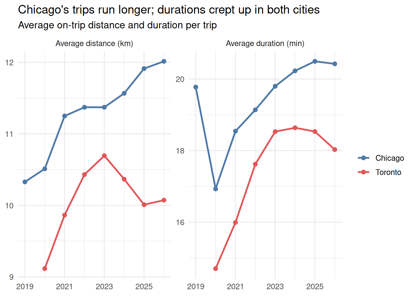
trip_miles/trip_seconds; Toronto from oh_month on-trip totals per reported trip. 2026 covers January–June.
Chicago’s trips are consistently the longer of the two — about 12 km versus Toronto’s ~10 km — and have kept lengthening, while Toronto’s distance peaked around 2023 and has since eased back. Durations tell a congestion story: both cities climbed off their 2020 pandemic low (Toronto steeply, from a short-trip base) toward ~18–20 minutes, as trips became both longer and slower.
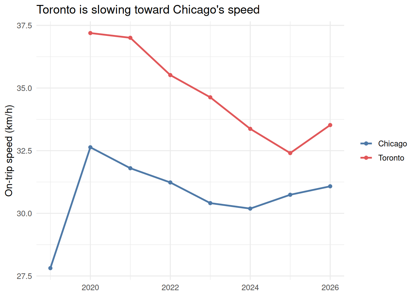
On-trip speed ties distance and duration together. Chicago is roughly flat (~30–31 km/h); Toronto declines steadily (37→32 km/h), a congestion signal consistent with toronto_wait.qmd (the geography of that slowdown is dissected in Section 7).
Downtown vs. the rest of the city
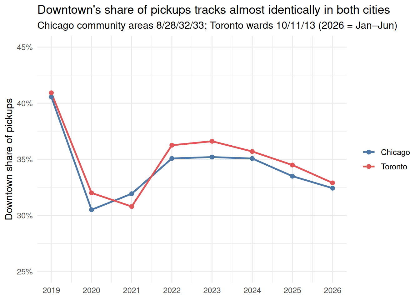
Both cities have a defined downtown core — Chicago community areas 8/28/32/33 (Near North, Near West, Loop, Near South); Toronto wards 10/11/13 (Spadina-Fort York, University-Rosedale, Toronto Centre). Classifying trips by pickup (Toronto limited to city pickups, so “other” is the rest of the city) reveals a striking structural parallel.
The first parallel is how much of the city’s ridehail activity the core accounts for. Figure 7 plots the downtown share of pickups each year — downtown trips as a fraction of all trips picked up within the city (Chicago: of trips with a known community area; Toronto: of trips picked up in the city). The two lines move in near-lockstep: about 40% of pickups were downtown pre-pandemic, both cities fell to ~31% during 2020–21 as the core emptied, both recovered to ~35–36% by 2022–24, and both have edged back down to ~33% in 2025–26 as ridehail keeps spreading into the suburbs.
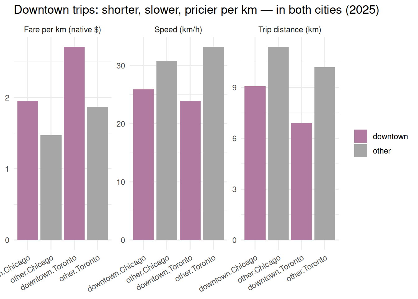
Downtown is ~⅓ of pickups in both cities, and downtown trips are shorter, slower (~24–26 km/h, a cross-city near-constant), and cost more per km. That “slower” finding is worth pulling apart by geography over time. Figure 9 splits on-trip speed into the downtown core versus the rest of each city, year by year.
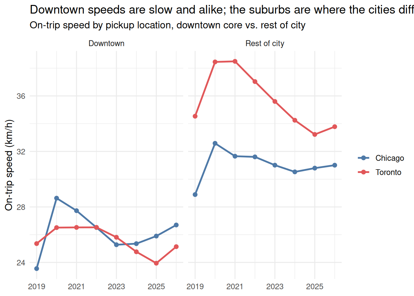
Two things stand out. In the downtown panel the two cities sit almost on top of each other at ~24–26 km/h across the whole period — downtown congestion is a shared physical constant, not a city-specific choice. In the rest-of-city panel they separate: Toronto’s non-downtown trips run several km/h faster than Chicago’s (~33–34 vs ~31), and it is Toronto that is visibly slowing — its suburban speed fell from ~38 km/h in 2020–21 toward ~33 by 2025, closing on Chicago, the same city-wide congestion signal seen in Section 6. Both cities show the 2020–21 pandemic speed bump before traffic returned.
But higher fare/km partly just reflects shorter trips (fixed booking fee spread over fewer km). To isolate a genuine location premium, take the fare residual net of a within-city time+distance model (the same base + per-km + per-minute fit tabulated in Table 2, applied per trip / per cell):
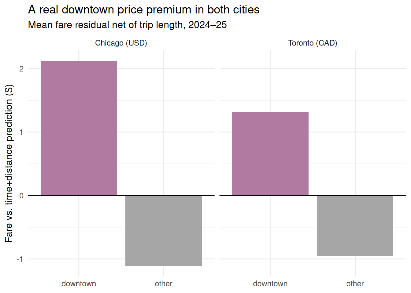
Net of trip length, downtown pickups are priced above the time-and-distance line in both cities (~+$2.1 Chicago, +$1.3 Toronto) while the rest of the city is priced slightly below — the location-based premium chicago_algorithmic_pricing.qmd documents, present in Toronto too. See to_chi_observations.md §C5.
Fleet size and productivity
Chicago active drivers vs Toronto active vehicles (not identical units — see notes). Toronto fields more vehicles than Chicago has drivers for the same daily volume, and Chicago drivers turn more trips per unit — consistent with Toronto’s lower, falling utilization.
# A tibble: 13 × 4
    year  units trips_per_unit_mo city
   <dbl>  <dbl>             <dbl> <chr>
 1  2019 71386.             130.  Chicago (drivers)
 2  2020 36028.             116.  Chicago (drivers)
 3  2021 33156.             128.  Chicago (drivers)
 4  2022 43008.             134.  Chicago (drivers)
 5  2023 52032.             133.  Chicago (drivers)
 6  2024 57134              131.  Chicago (drivers)
 7  2025 60721.             127.  Chicago (drivers)
 8  2020 35689.              71.8 Toronto (vehicles)
 9  2021 31886.              77.2 Toronto (vehicles)
10  2023 58269.              88.3 Toronto (vehicles)
11  2025 75270.              96.4 Toronto (vehicles)
12  2022 42283               89.4 Toronto (vehicles)
13  2024 69763.              89.2 Toronto (vehicles)
Utilization — Toronto only, and why it matters
Chicago publishes no idle-time data, so this panel is Toronto-only. It motivates the complement analysis (imputing Chicago utilization from Toronto’s relationship) developed separately — see to_chi_observations.md Part C.
# A tibble: 6 × 3
   year utilization_pct hours_per_week
  <dbl>           <dbl>          <dbl>
1  2020            43.0           9.91
2  2022            59.8          10.2
3  2024            50.8          12.5
4  2021            51.4           9.35
5  2023            55.8          11.3
6  2025            49.7          13.8
Imputing Chicago’s hidden utilization
Chicago publishes no idle-time data. But utilization obeys an exact fleet-level identity, U \;=\; \text{TPH} \times \frac{d}{60}, where U is the on-trip fraction, d is mean on-trip minutes per trip, and \text{TPH} = 60 \times \text{trips} / \text{working minutes} is fleet trips per working hour (independent of whether we count vehicles or drivers). Chicago gives us d and trips, but not working hours — so \text{TPH}_{chi}, and hence U_{chi}, is unobserved. We bound it.
First, confirm in Toronto that the utilization decline is a TPH decline (not fewer trips): trips per vehicle held flat while hours rose, so TPH — and U — fell, and the freed time became idle (P1) share.
# A tibble: 6 × 5
   year   tph d_min u_pct p1_idle_pct
  <dbl> <dbl> <dbl> <dbl>       <dbl>
1  2020  1.75  14.7  43.0        45.5
2  2022  2.04  17.6  59.8        22.1
3  2024  1.64  18.6  50.8        38.1
4  2021  1.93  16.0  51.4        32.4
5  2023  1.81  18.5  55.8        30.9
6  2025  1.61  18.5  49.7        39.5
Now impute Chicago’s U under two assumptions for \text{TPH}_{chi}:
- own-bands — the trips↔︎hours bands in
chicago_drivers.qmdimply \text{TPH}_{chi} \approx 1.9 (held flat); - Toronto-transfer — set \text{TPH}_{chi} = \text{TPH}_{tor} each year.
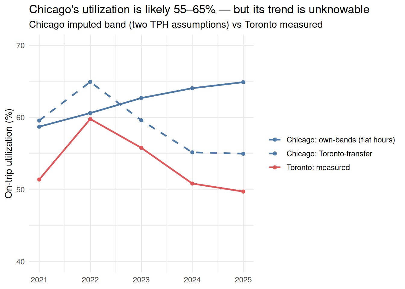
The two Chicago scenarios bracket a ~10-point band by 2025, sitting at or above Toronto’s measured line — Chicago’s longer trips and tighter fleet both raise its utilization. What the data cannot resolve is whether Chicago’s utilization fell (Toronto-transfer) or held (own-bands): that turns entirely on the trend in Chicago driver hours, which Chicago never publishes. Toronto shows why that omission matters — there, flat trips-per-driver masked a decade-defining 10-point utilization drop, an invisible pay cut. See to_chi_observations.md §C2.
Deadheading and total VMT
Chicago publishes only occupied trip miles. Toronto publishes routed distance for every phase, so it can measure empty miles — idle cruising (P1 available) plus en-route-to-pickup (P2 enroute). We use Toronto to see the empty-mile trend, then impute Chicago’s total VMT.
# A tibble: 6 × 4
   year u_pct empty_share  mult
  <dbl> <dbl>       <dbl> <dbl>
1  2020  43.0        40.7  1.69
2  2022  59.8        26.7  1.36
3  2024  50.8        34.7  1.53
4  2021  51.4        33.2  1.50
5  2023  55.8        30.2  1.43
6  2025  49.7        34.6  1.53
Empty share moves inversely with utilization — as the fleet idles, cruising miles pile up. The relationship is near-linear, which lets us map Chicago’s imputed utilization (previous section) to an empty-mile estimate rather than transplanting Toronto’s current ratio (Chicago’s tighter fleet would make that an overstatement).
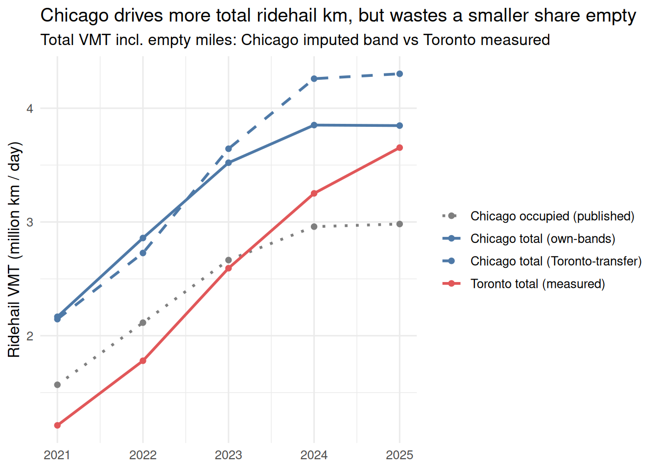
Both cities put roughly 1 million km/day of empty ridehail driving on the road — a congestion externality with no passenger aboard. Toronto’s empty share is rising (27%→35% since 2022) as its fleet grew and idled; Chicago’s imputed share is lower and flatter, matching the two cities’ divergent speed trends (Section 6). Chicago cannot see this in its own data — the empty miles are exactly what Toronto measures and Chicago omits. Full method and caveats (Chicago’s empty VMT is doubly imputed): to_chi_observations.md §C3/§B7.
Driver turnover
Cohort retention on a common axis. For each 2022–24 start cohort we track the share of units still active (≥1 trip in the month) at each horizon, indexed to month 1 (= 100%) to skip the register-but-not-yet-driving effect — the convention used in chicago_drivers.qmd.
The definition is identical across cities, but the unit differs: Chicago counts drivers (driver_start_month), Toronto counts vehicles (vehid first active month in operating_hours). A vehicle can outlast the driver behind it, so Toronto’s higher retention is partly a vehicle-vs-driver artifact — read the gap’s direction with more confidence than its magnitude.
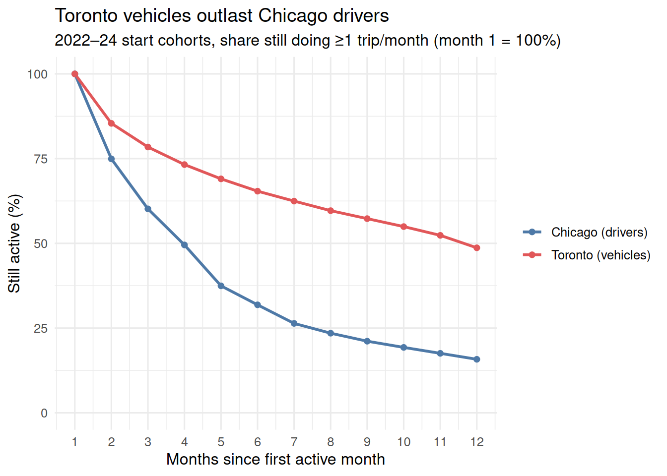
By month 12 roughly half of Toronto’s cohort is still active versus about a sixth of Chicago’s — Toronto ~52% churn/yr (consistent with opendata.qmd), Chicago ~84% on this stricter monthly-active measure (the “two-thirds quit” figure in chicago_drivers.qmd uses panel presence, a laxer denominator).
Summary table
  year chi_drivers chi_fare_usd chi_speed_kmh tor_daily_trips tor_vehicles
1 2020    36027.50        12.14          32.6           88557     35689.33
2 2021    33155.92        17.97          31.8           82076     31885.83
3 2022    43008.25        19.60          31.2          125051     42283.00
4 2023    52032.25        17.19          30.4          169372     58269.08
5 2024    57134.00        17.69          30.2          204265     69762.58
6 2025    60721.33        17.98          30.7          238542     75270.08
  tor_fare_cad tor_speed_kmh tor_util_pct
1        17.89          37.2         43.0
2        20.39          37.0         51.4
3        22.99          35.5         59.8
4        22.43          34.6         55.8
5        20.59          33.4         50.8
6        20.24          32.4         49.7