Introduction
The City of Toronto has started publishing open data about ride-hail operations in the Greater Toronto Area:
Private Transportation Companies - Summary and Trip Data. two data sets. Summary Stats is a small file with per-day city-wide statistics (3000 rows) like trip counts and utilization averages, which is useful for describing overall trends. Trips consists of 20 million rows, each describing trips between municipalities or, for Toronto itself, city wards (trip count, average distance, average fare etc).
Private Transportation Companies – Vehicle Operating Data. Each row is one vehicle active in one hour, with information about its time on the app (P1, P2, P3), fares, estimated distance travelled. There are 300 million rows!
Private Transportation Companies - Summary and Trip Data. two data sets. Summary Stats is a small file with per-day city-wide statistics (3000 rows) like trip counts and utilization averages, which is useful for describing overall trends. Trips consists of 20 million rows, each describing trips between municipalities or, for Toronto itself, city wards (trip count, average distance, average fare etc).
Private Transportation Companies – Vehicle Operating Data. Each row is one vehicle active in one hour, with information about its time on the app (P1, P2, P3), fares, estimated distance travelled. There are 300 million rows!
For more details, see the readme file the City provides on each of the download pages.
These data sets comprise the best public data sets we know about ridehail activity. They go beyond the Chicago and New York public data sets in that they include utilization data (including “P1 time”: driver time “on the app” but not assigned to a particular trip), and with fare data as well it gives a lot of leverage to ask some questions. Also, the CIty Transportation Services team has implemented route-modelling algorithms to fill out the reported data, so this is more than just a dump of what Uber and Lyft gave them. Congratulations and thanks to the Transportation Services staff on the scope and carefulness of their work.
There is a lot in the data sets that we don’t explore here. For example, there are statistics on wheelchair-accessible-vehicle (WAV) trips that we don’t explore here.
Overall Trends
Trip Numbers
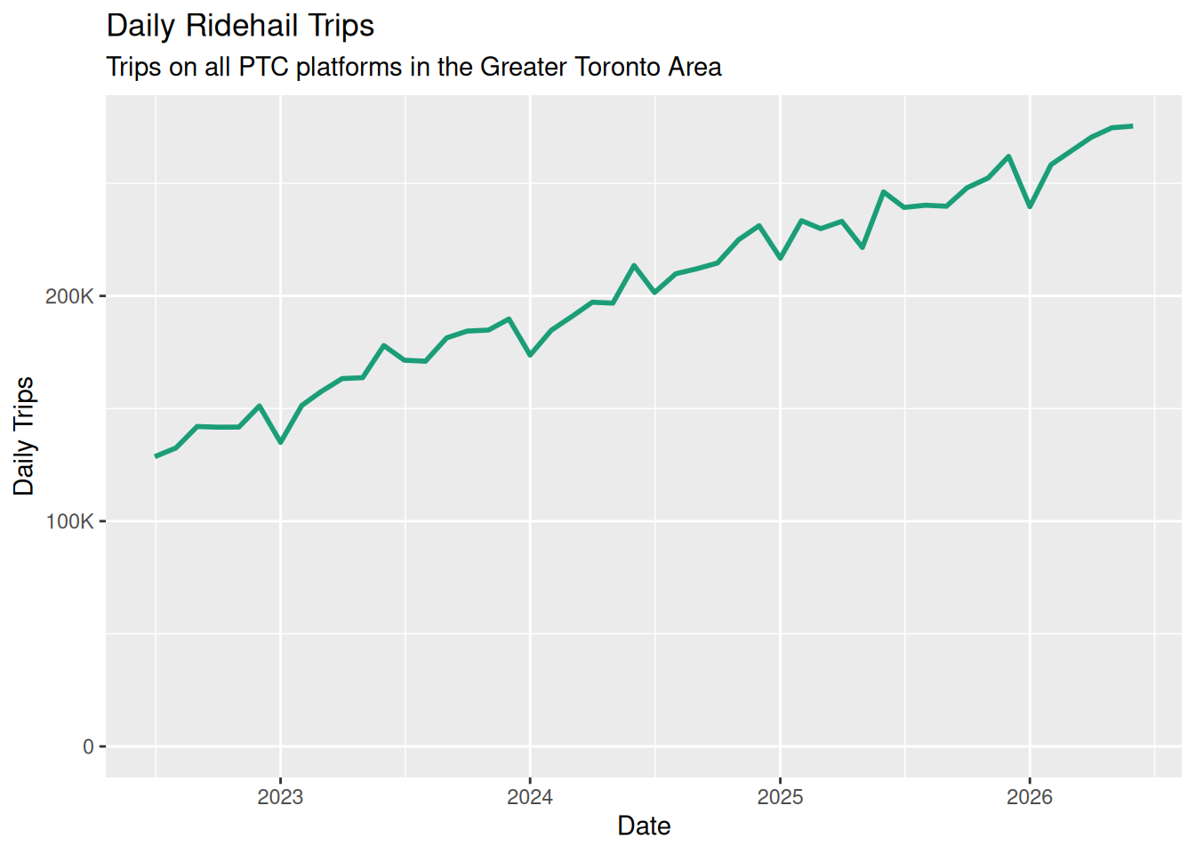
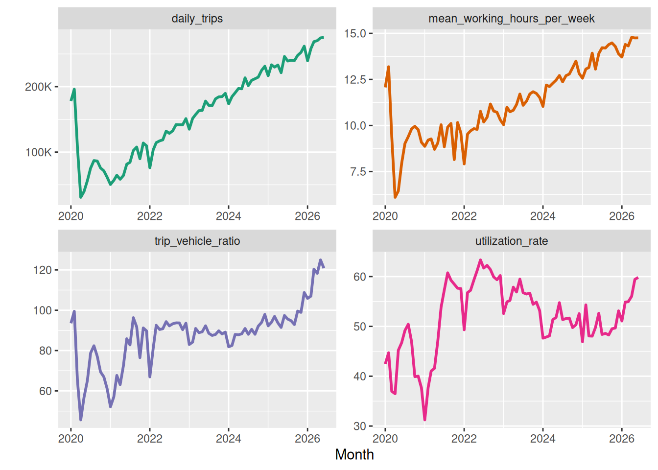
The number of trips per day has now reached a quarter of a million. After the massive dropoff because of Covid, Figure 1 shows a steady growth in trips over the last five years. While this is a massive number, it is worth noting that it is only one-tenth of the number of passenger boardings on the TTC each weekday.
Active Driver Numbers
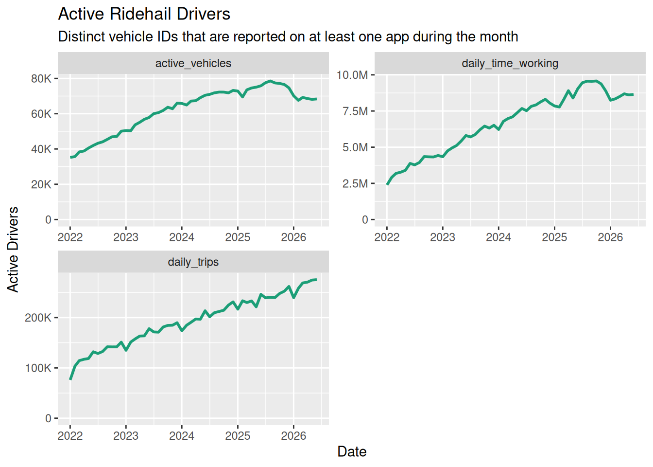
Strictly speaking, the data set tracks vehicles, but we assume here that one vehicle equals one driver. Figure 2 shows that the number of drivers was also steadily increasing until 2025. The data set does not distinguish among PTCs (Uber, Lyft) but does disaggregate vehicles, so that a driver on both platforms is not counted twice.
Other Statistics
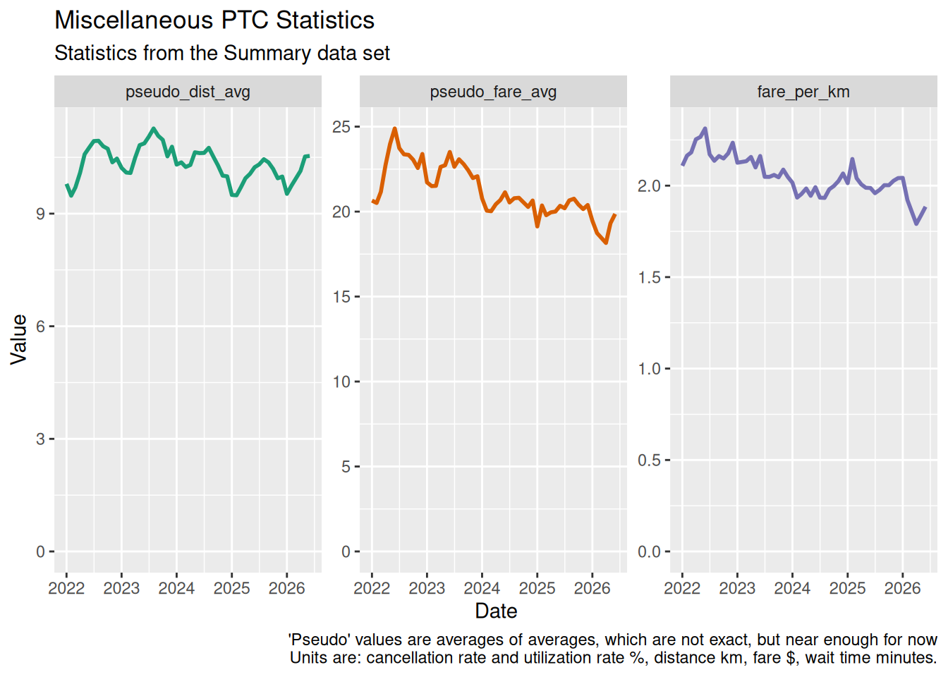
While the number of trips and drivers has increased, many other trip characteristics have stayed fairly constant since the recovery from Covid restrictions. Figure 3 shows some of these. (The averages are “averages of averages” so not precise, but for a first look I hope it’s close enough).
Supply and Demand: Drivers and Trips
Figure 1 and Figure 2 show that both driver and trip numbers have been increasing. Let’s look a little closer.
Supply and Demand: Long-Term Trends
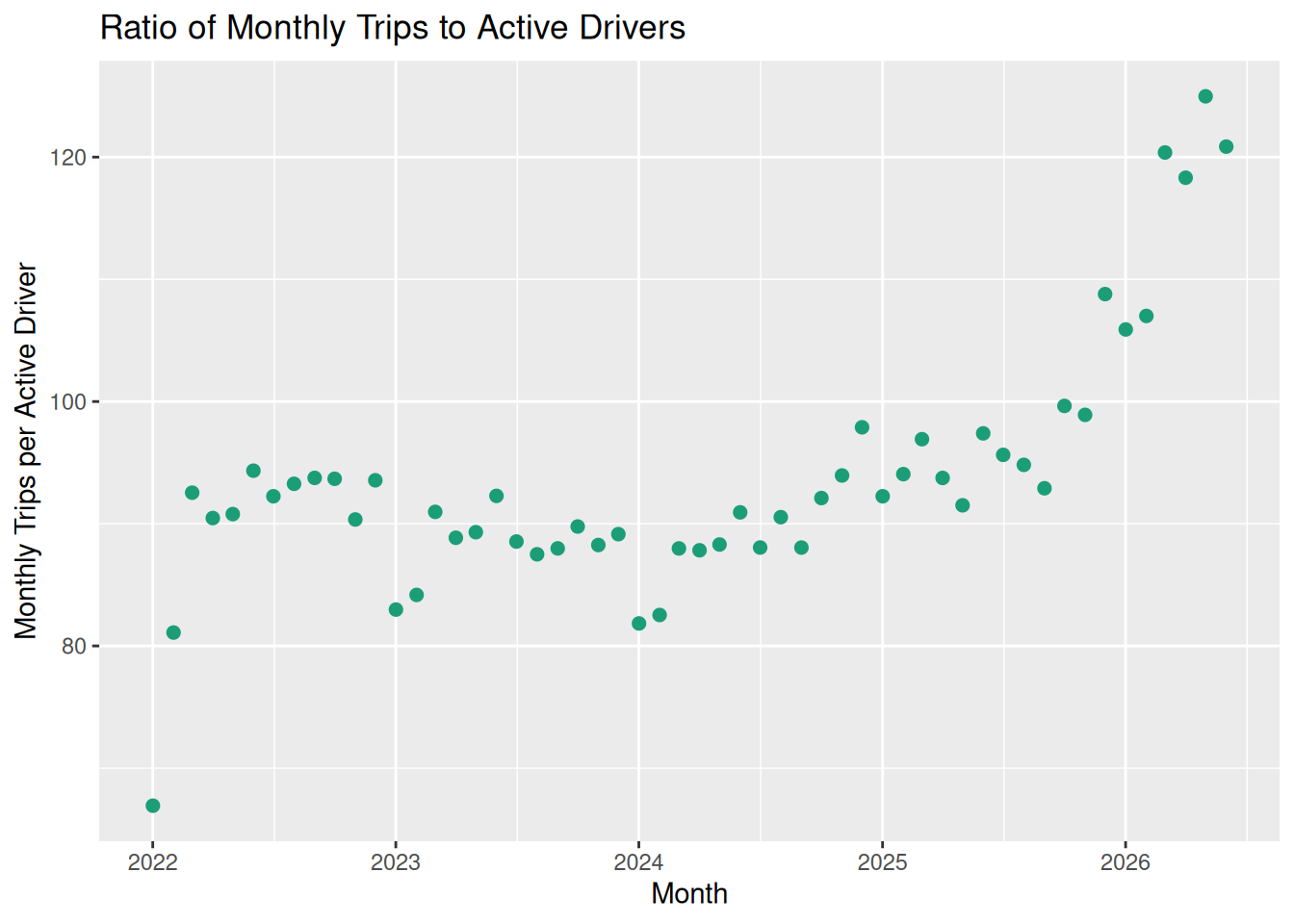
Figure 4 shows the long-term trends, as a ratio of daily trips per driver.
Supply and Demand: Hour of the Day
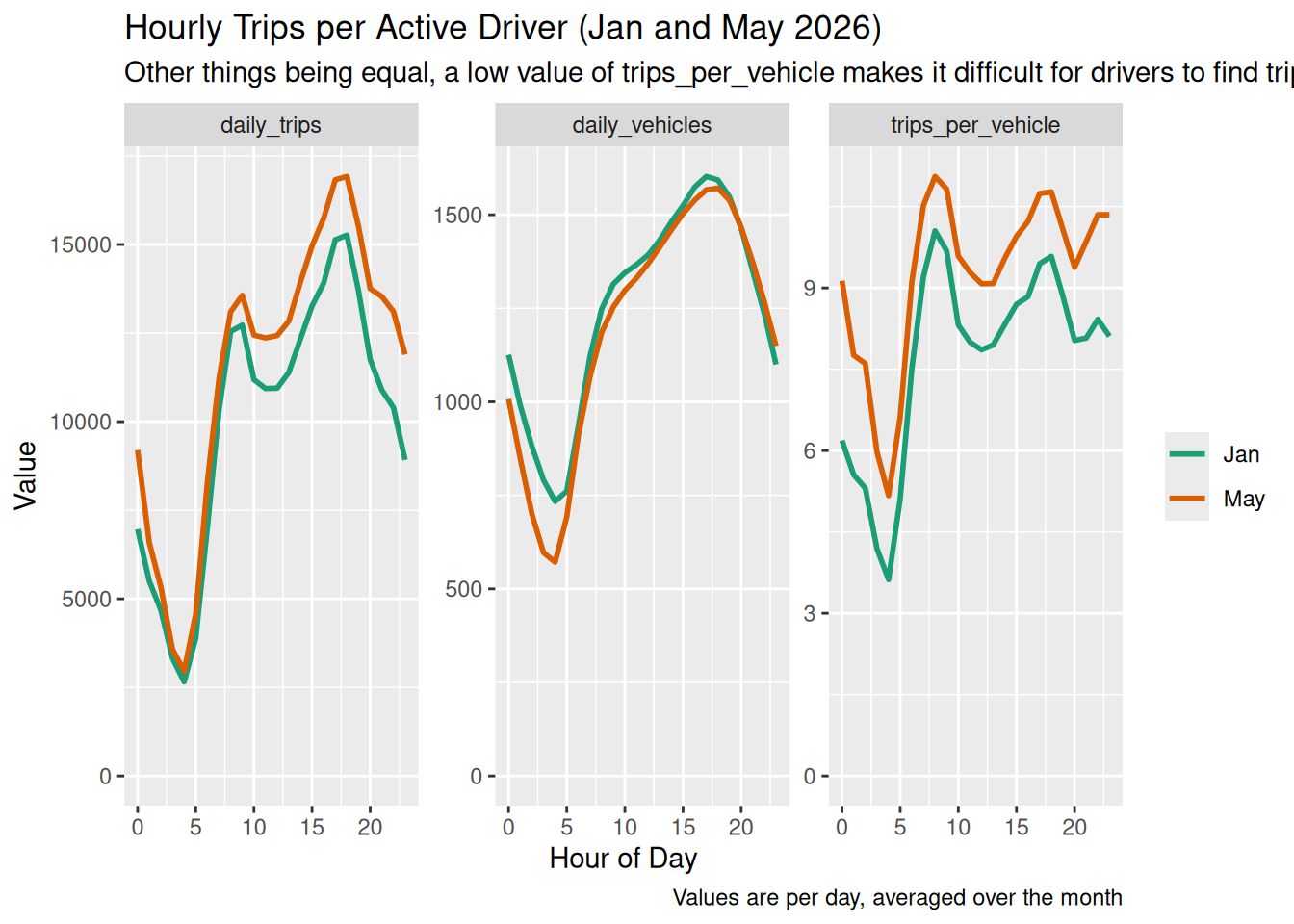
Figure 5 shows how the supply of drivers and demand for trips varies throughout the day. Each line shows an average over the given month. Some patterns are consistently present: overnight there are few drivers but even fewer trips
Utilization: Long-Term Trends
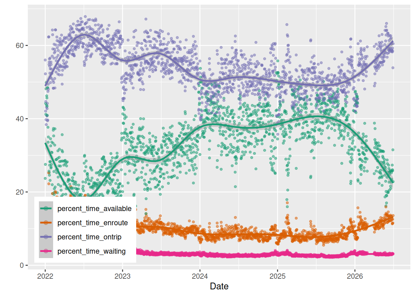
We would expect utilization rates to follow supply and demand. The key observation from Figure 6 is that, over a period of four yeats, utilization rates (that is, the percent of time that drivers are carrying passengers and being paid) have fallen from 59% in 2022 t0 50% in 2025: an effective pay cut of 16%.
Utilization and Supply/Demand
Previous plots seem to show a contradiction: a falling utilization rate on one hand, but also a rising ratio of trips to drivers. These two should go in the same direction but the plots suggest (with noise) that they are going in opposite directions.
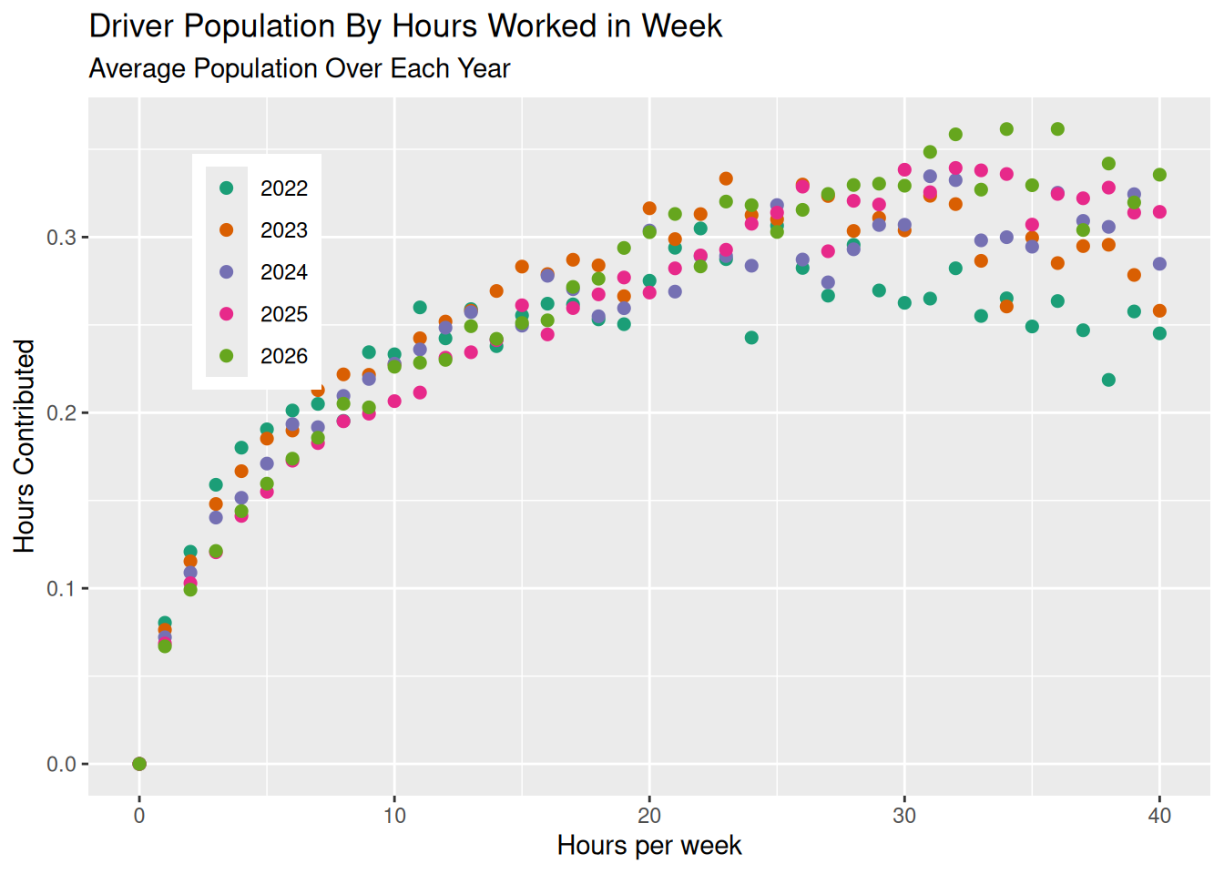
Figure 7 provides an explanation. The average number of working hours per week for a driver has increased from about 10 in 2022 by over a third, to almost 14 hours per week in 2025. Even though there are more trips per driver, each driver is on the road for longer, so the utilization rate has not improved.
Utilization Rates By Hour of Day
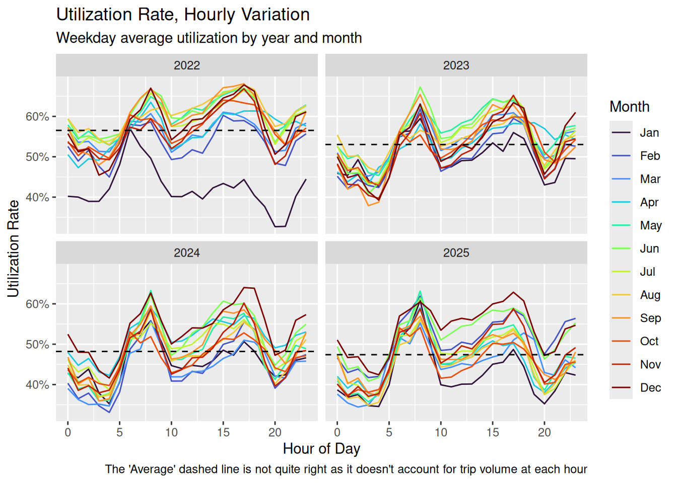
Figure 8 shows how utilization rates change over the course of a day. Utilization is high around morning and afternoon rush hours, but full-time drivers must also be on the road at low-utilization times to make a living. There is no sign of improvements to the low utilization rates.
Utilization Rates By Driver Commitment
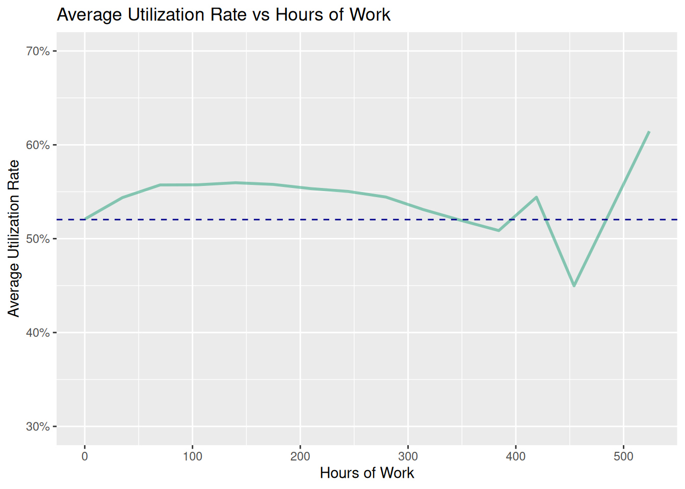
Showing this for a single day works well. The results seem to be fairly independent of day. The average utilization rate is pretty similar for all drivers up to about 10 hours work. After that, the rate falls off.
Driver Turnover
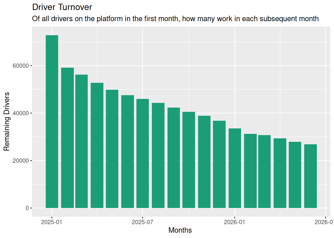
Figure 10 shows that about half of all drivers leave within a year of starting work. Some small percentage of the changes may be drivers changing vehicles, but we judge this to be a small effect.
Part-Time and Full-Time Drivers
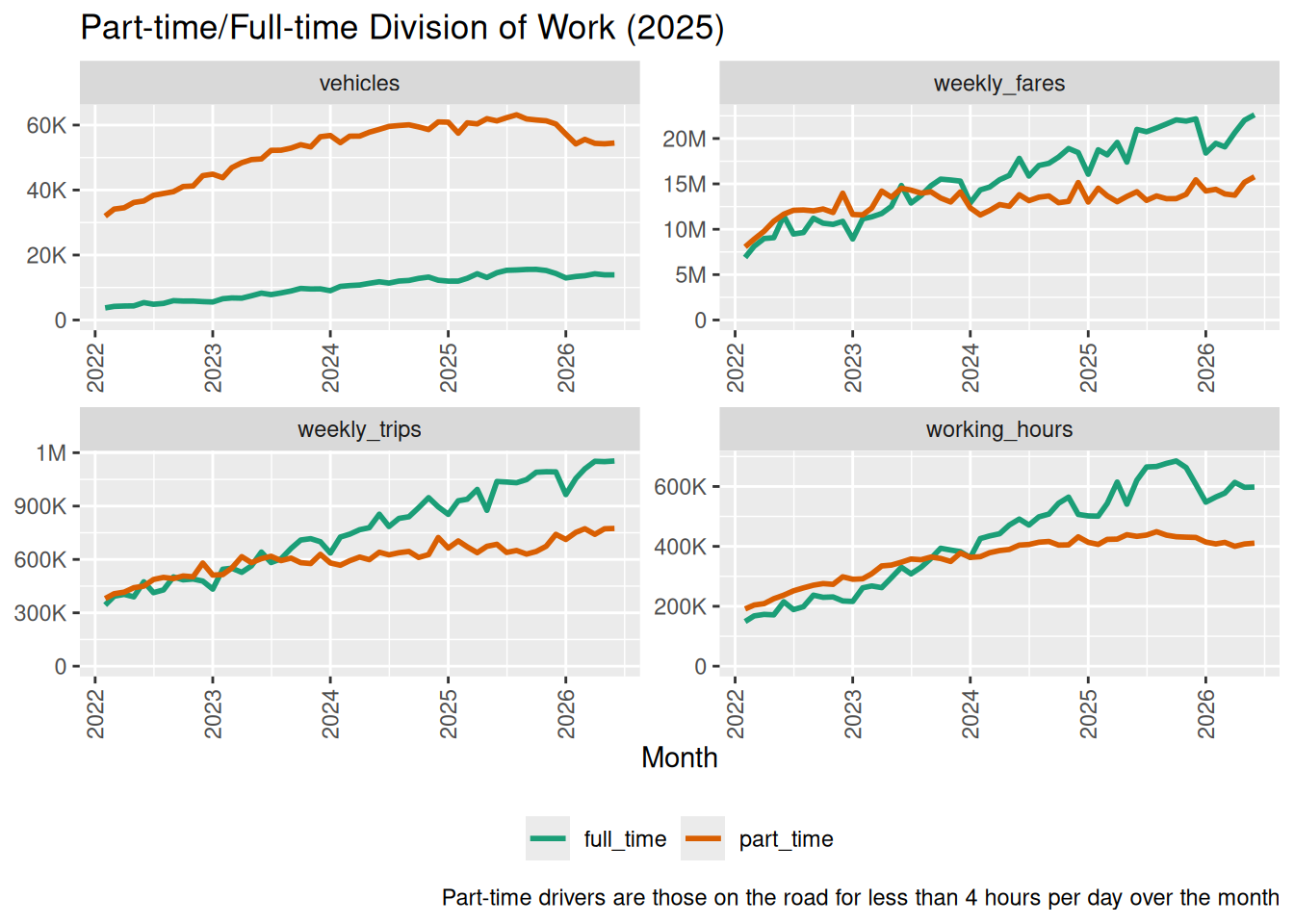
In this section, “part-timers” are those who work (on average) less than four hours per day during a given month. If we change the dividing line then the absolute values change, but the trends remain the same.
Long-Term Trends
Figure 11 shows that although part-timers make up the bulk of the workforce, full-timers obviously make up more of the hours and over half of the trips. Also, confirming the observation from Figure 7, the role of full-time drivers has become more and more important over time.
What Time of Day Do Part-Timers Work?
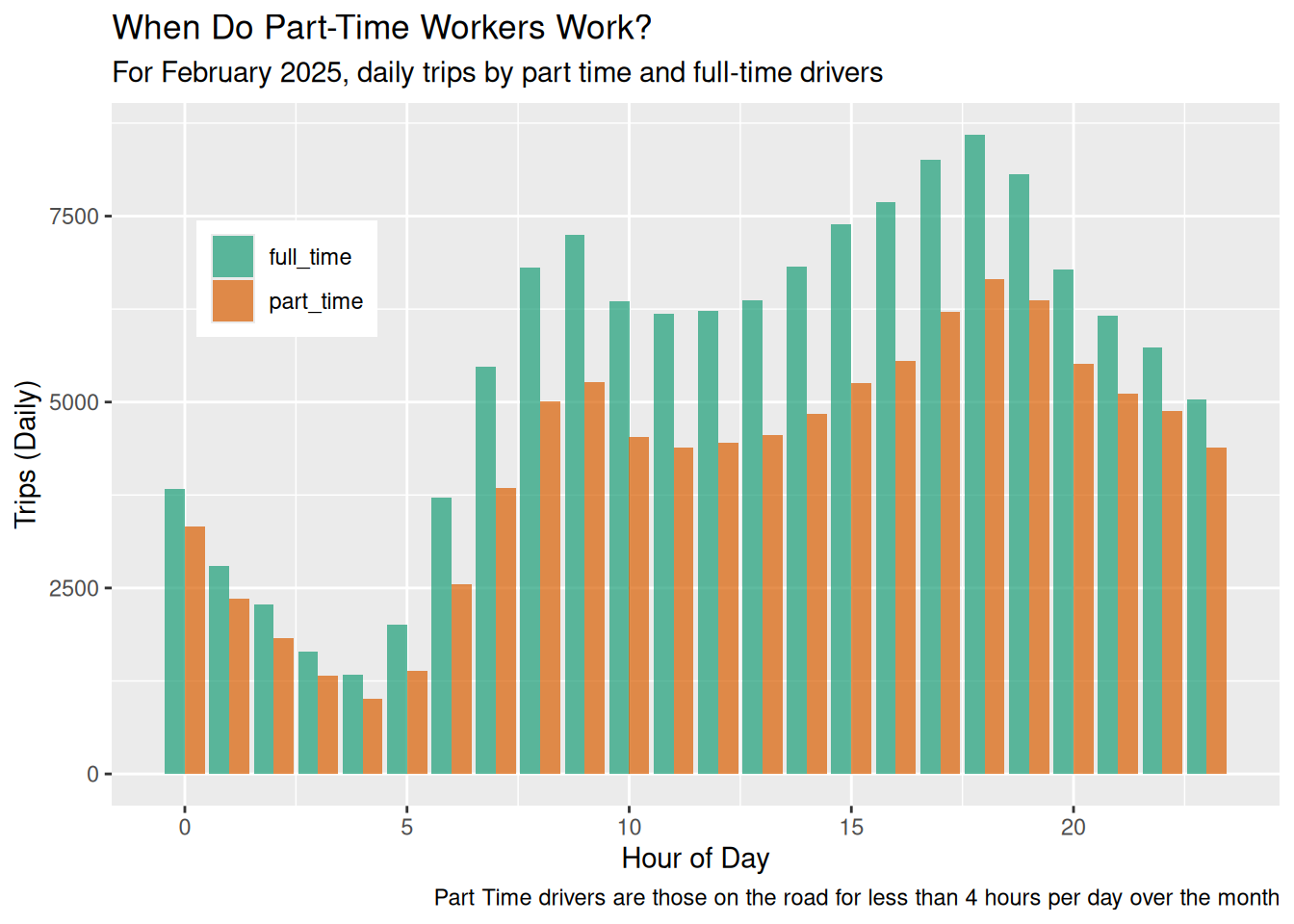
Figure 12 shows that part-timers make up a higher proportion of vehicles during the hours from the late morning to the early evening.
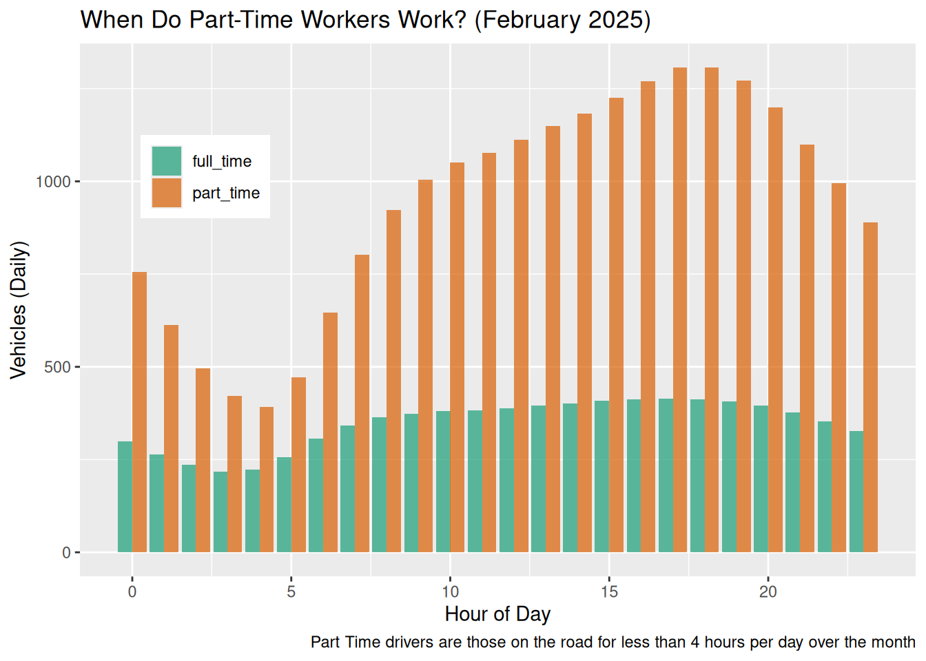
Figure 13 shows that there are no particular times that are “part-timer hours” from the point of view of trips.
Driver population by hours per week
Cancellations
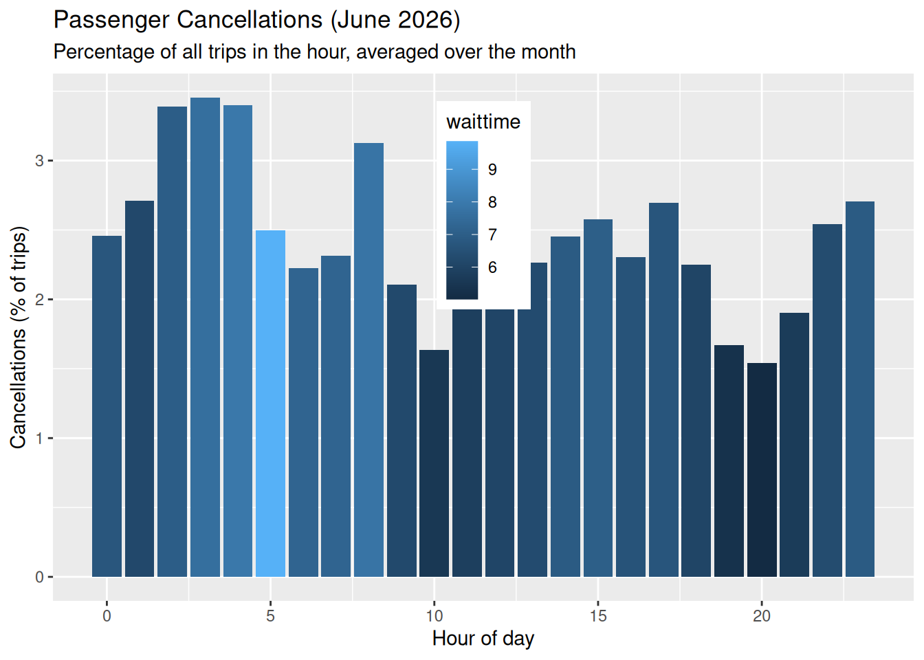
Figure 15 shows the passenger cancellations across the GTA by the hour of day, with the colouring representing the average wait time during that hour. Passenger cancellations can be over 10% of requests.
In the morning rush hour (8am) there is a long wait time and high cancellation rates. The same pattern happens (but with many fewer trips) at two in the morning. Wait time is a factor in shaping cancellation rates, but not the only one: there is an elasticity to the demand that depends on the time of day.
Fleet Efficiency
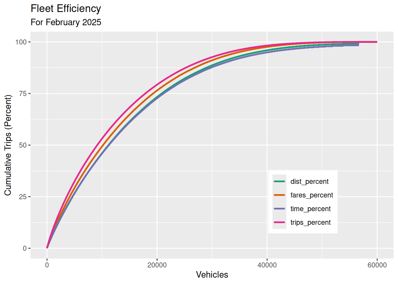
Figure 16 shows that about a third of drivers account for over three-quarters of all trips. Idle vehicles contribute to congestion and low pay among drivers.
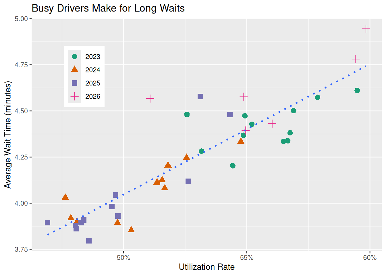
Wait times and utilization
Geography
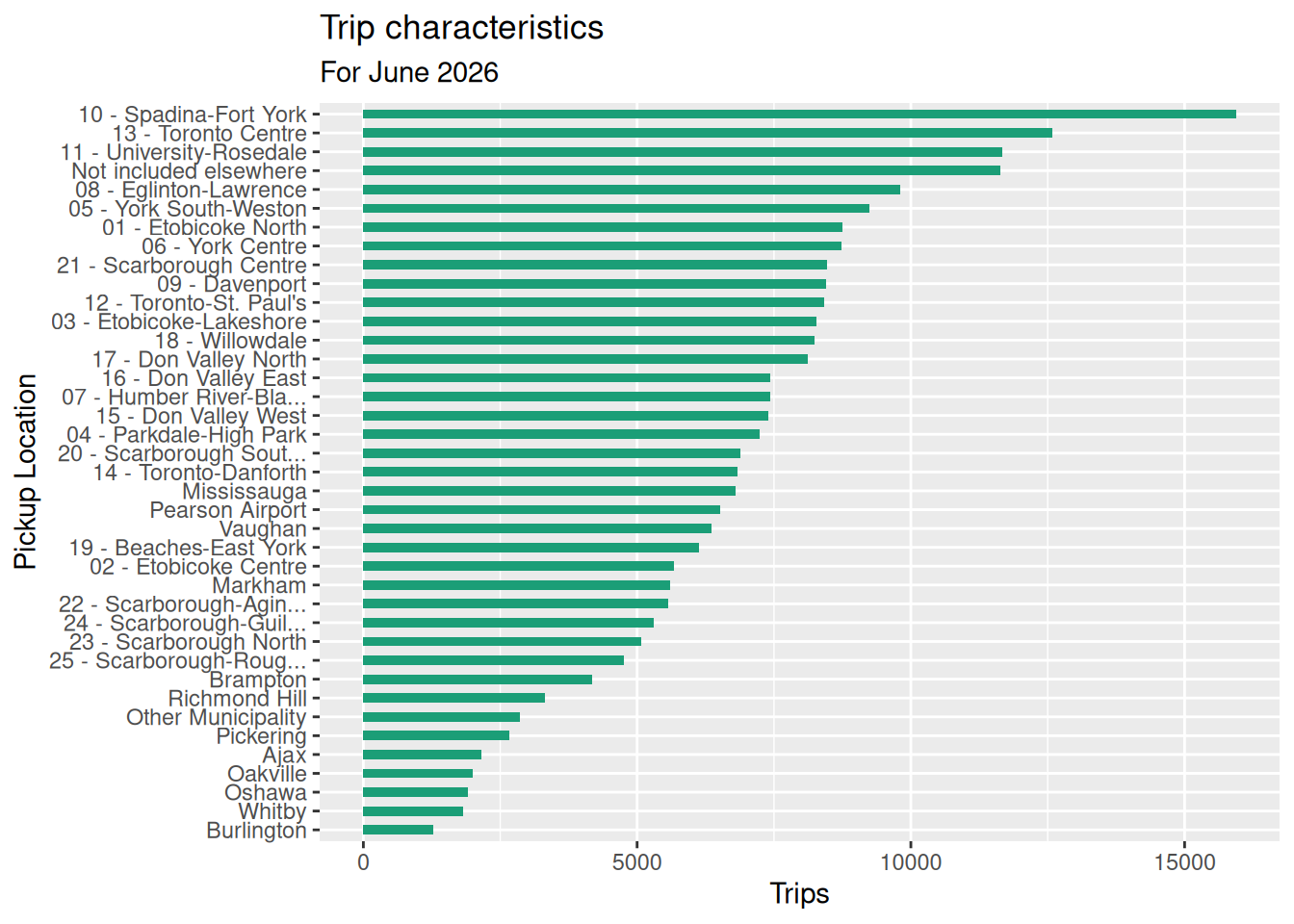
Here’s a first look at trips by location. No conclusions yet.
Ward 13 - Toronto Centre
Ward 13, Time of Day
Wheelchair Accessible Vehicles
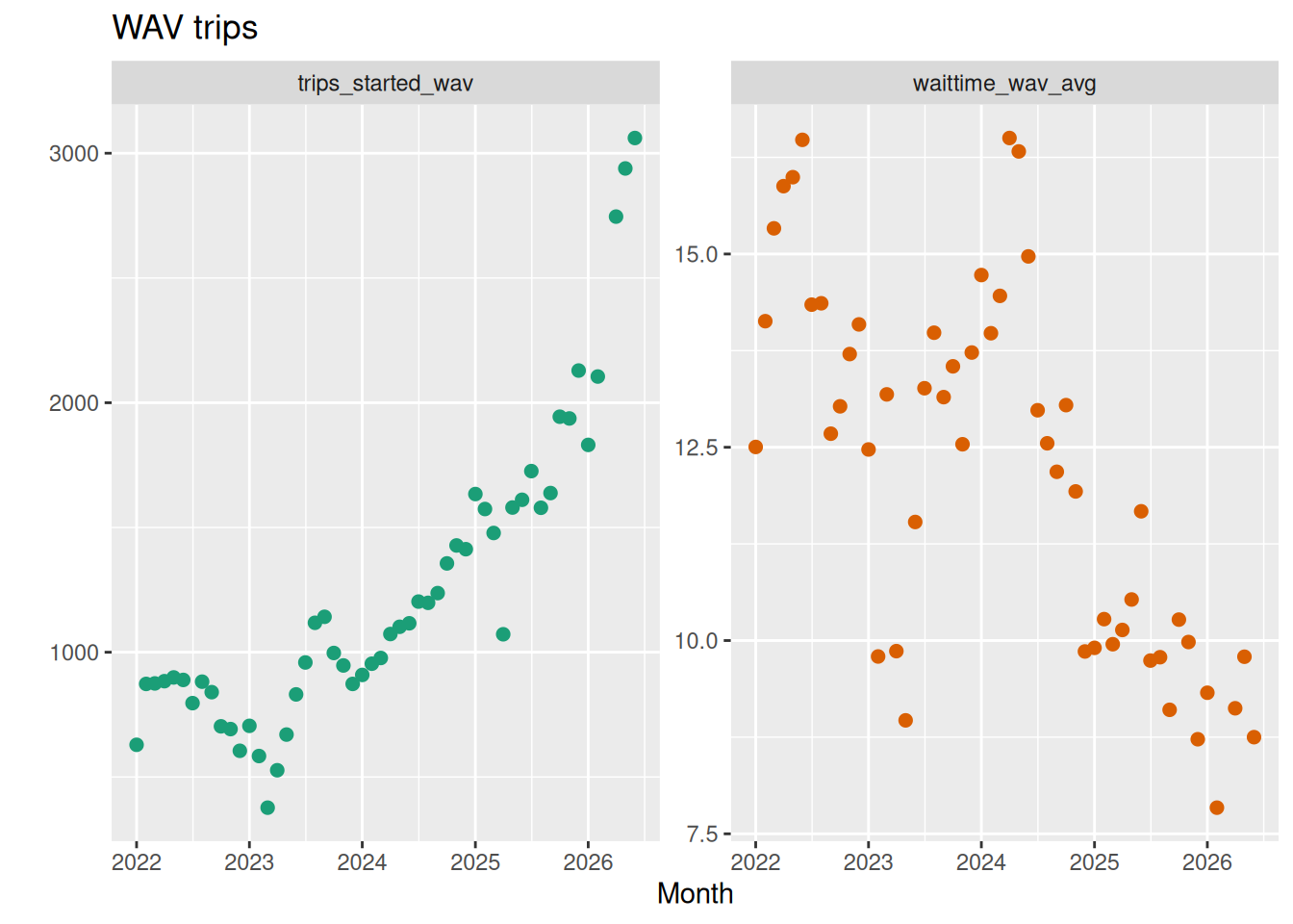
How many trips are supplied by wheelchair accessible vehicles (“wav” trips), and with what wait times?
Algorithmic Pricing?
I don’t know if we can say anything useful here, but let’s try.
Traffic Speed
The only table with both time and distance data is trips, which includes pickup_ward, dropoff_ward, distance_avg, and duration_avg. Using averages to compute further averages is inexact, but may be the best we can do.
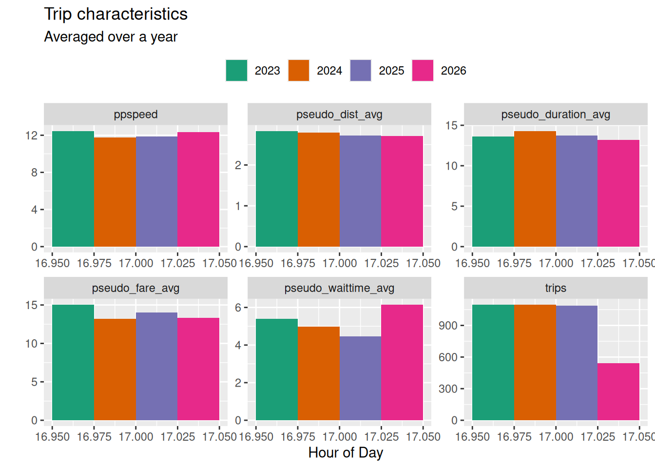
Speeds are slowest at around 5pm.